prototyping
digital
brochure
prototyping
digital
brochure
In today’s world, filled with countless choices, it’s crucial to deliver a message that not only stands out but also builds a relationship based on trust.
As part of a client project, based on their specific brief, I created a digital leaflet designed to support Brand Ambassadors during direct consumer interactions. This design helps present the offer in a clearer way, making key product information more accessible and engaging for the audience.
W miastach, gdzie rowery znów stają się coraz bardziej popularne, aplikacja Nextbike ma przed sobą ważne zadanie - przyciągnąć i zaangażować użytkowników, zwłaszcza po trudnym okresie pandemii COVID-19.
Postanowiłem wprowadzić świeży powiew w postaci segmentu gamifikacji, który sprawi, że korzystanie z rowerów stanie się prawdziwą przygodą. Chciałbym, aby każdy użytkownik mógł cieszyć się nie tylko jazdą na rowerze, ale także zdobywaniem nagród i osiągnięć.


category
UX/UI Design
Prototyping
category
UX/UI Design
Prototyping
category
UX/UI Design
Prototyping
type
Commercial
type
Commercial
type
Commercial
software
Figma
After Effects
software
Figma
After Effects
software
Figma
After Effects
timeline
05.2024
timeline
05.2024
timeline
05.2024
about project
about project
Problem
Brand representatives often face the challenge of delivering key information quickly and effectively in high-pressure sales environments. Traditional print materials can be disengaging and fail to support the brand ambassadors in building relationships with consumers.
Solving
The goal was to create a digital leaflet that serves as an essential tool for brand ambassadors during consumer interactions, presenting information clearly while engaging the audience and helping to build trust.
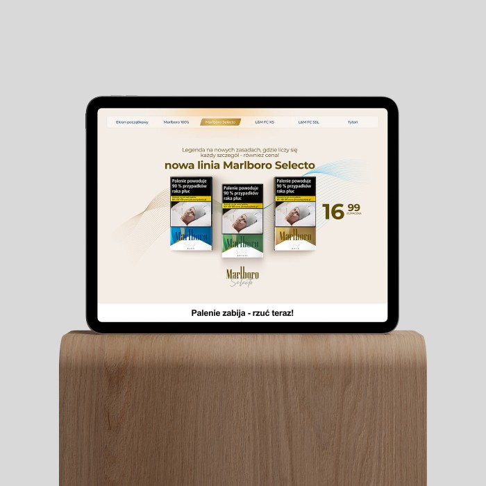


This project was created in response to a detailed client brief, which provided clear direction and included open Key Visual (KV) assets to be used throughout the design. Prototyped in Figma, the goal was to develop a digital leaflet for Brand Ambassadors of LM and Marlboro, to be used during in-person interactions with consumers. The leaflet was designed to ensure that ambassadors could easily present the brand’s offerings while maintaining consumer engagement. By incorporating the client’s visual guidelines, the project aimed to deliver a visually cohesive and informative tool that aligned with the brand’s identity, helping ambassadors convey key product details in a clear and appealing manner.
briefing
briefing
briefing
briefing
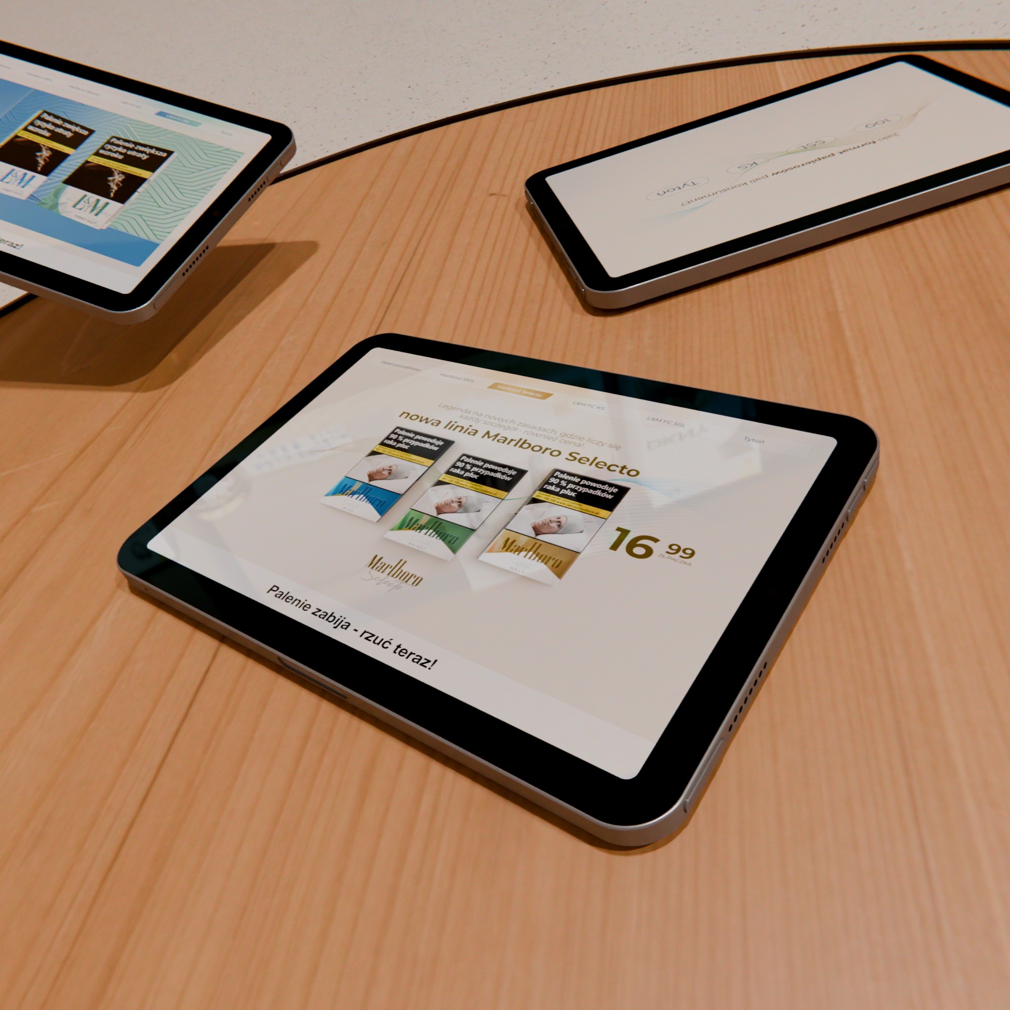
We received a comprehensive brief from the client that included detailed guidelines and ready-made Key Visuals for adaptation. This provided a solid foundation for our project, ensuring that we could align our design with the brand’s established identity and messaging from the outset. Having access to these visual assets allowed us to focus on creating a digital leaflet that would effectively engage consumers while maintaining brand consistency.

We received a comprehensive brief from the client that included detailed guidelines and ready-made Key Visuals for adaptation. This provided a solid foundation for our project, ensuring that we could align our design with the brand’s established identity and messaging from the outset. Having access to these visual assets allowed us to focus on creating a digital leaflet that would effectively engage consumers while maintaining brand consistency.

We received a comprehensive brief from the client that included detailed guidelines and ready-made Key Visuals for adaptation. This provided a solid foundation for our project, ensuring that we could align our design with the brand’s established identity and messaging from the outset. Having access to these visual assets allowed us to focus on creating a digital leaflet that would effectively engage consumers while maintaining brand consistency.

We received a comprehensive brief from the client that included detailed guidelines and ready-made Key Visuals for adaptation. This provided a solid foundation for our project, ensuring that we could align our design with the brand’s established identity and messaging from the outset. Having access to these visual assets allowed us to focus on creating a digital leaflet that would effectively engage consumers while maintaining brand consistency.
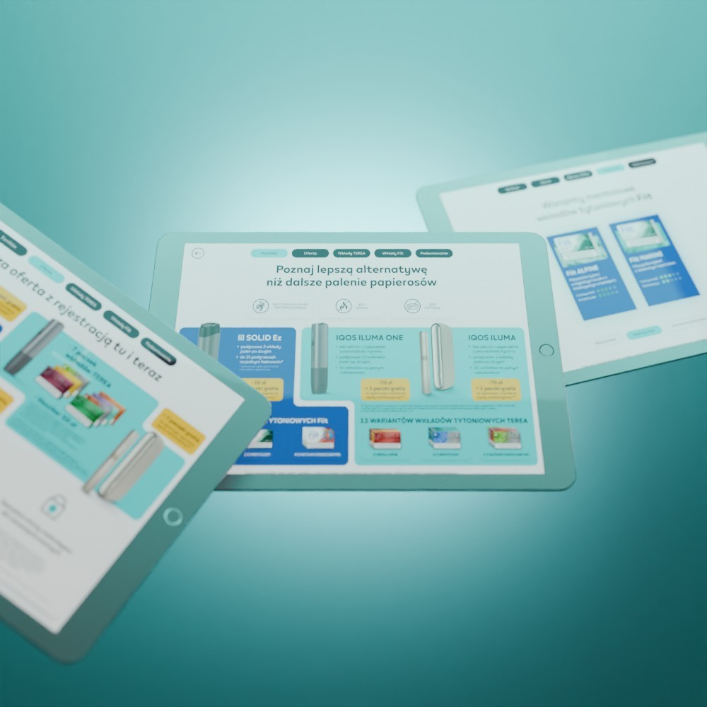
The new project built upon the success of a previous digital leaflet that had received overwhelmingly positive feedback from both the client and brand ambassadors. By leveraging insights gained from that earlier project, we aimed to enhance the design and functionality of the new leaflet, ensuring it would meet the needs of the ambassadors and resonate with consumers even more effectively.

The new project built upon the success of a previous digital leaflet that had received overwhelmingly positive feedback from both the client and brand ambassadors. By leveraging insights gained from that earlier project, we aimed to enhance the design and functionality of the new leaflet, ensuring it would meet the needs of the ambassadors and resonate with consumers even more effectively.

The new project built upon the success of a previous digital leaflet that had received overwhelmingly positive feedback from both the client and brand ambassadors. By leveraging insights gained from that earlier project, we aimed to enhance the design and functionality of the new leaflet, ensuring it would meet the needs of the ambassadors and resonate with consumers even more effectively.

The new project built upon the success of a previous digital leaflet that had received overwhelmingly positive feedback from both the client and brand ambassadors. By leveraging insights gained from that earlier project, we aimed to enhance the design and functionality of the new leaflet, ensuring it would meet the needs of the ambassadors and resonate with consumers even more effectively.
main rules
main rules
main rules
main rules
1
Present information in a clear and concise way to help brand ambassadors communicate effectively.
1
Present information in a clear and concise way to help brand ambassadors communicate effectively.
1
Present information in a clear and concise way to help brand ambassadors communicate effectively.
1
Present information in a clear and concise way to help brand ambassadors communicate effectively.
2
Follow the brand’s visual identity closely, ensuring all elements align with LM and Marlboro’s core aesthetic.
2
Follow the brand’s visual identity closely, ensuring all elements align with LM and Marlboro’s core aesthetic.
2
Follow the brand’s visual identity closely, ensuring all elements align with LM and Marlboro’s core aesthetic.
2
Follow the brand’s visual identity closely, ensuring all elements align with LM and Marlboro’s core aesthetic.
3
Incorporate smooth animations and interactive elements to create a more dynamic and engaging user experience that captivates attention and enhances usability.
3
Incorporate smooth animations and interactive elements to create a more dynamic and engaging user experience that captivates attention and enhances usability.
3
Incorporate smooth animations and interactive elements to create a more dynamic and engaging user experience that captivates attention and enhances usability.
3
Incorporate smooth animations and interactive elements to create a more dynamic and engaging user experience that captivates attention and enhances usability.
user flow
user flow
user flow
user flow


flat design
flat design
flat design
flat design












prototyping
prototyping
prototyping
prototyping
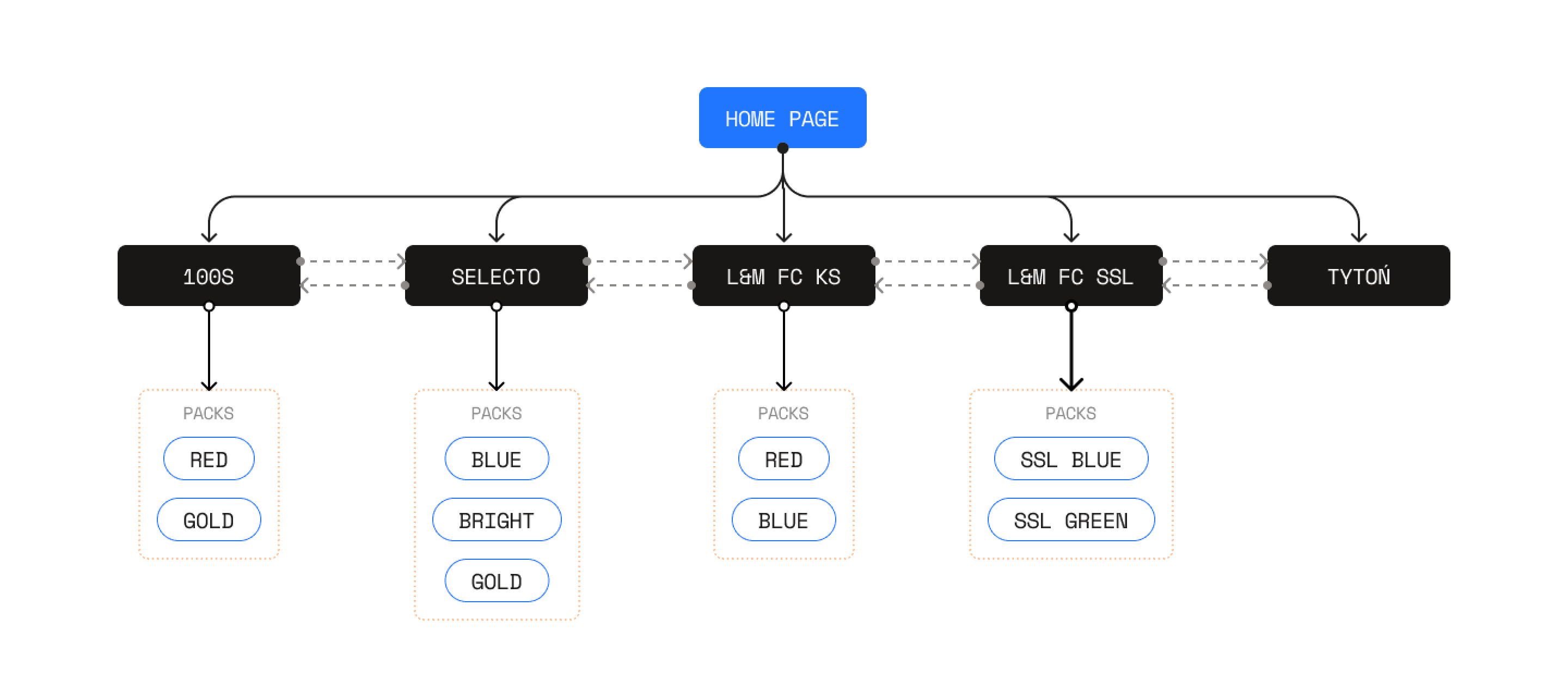
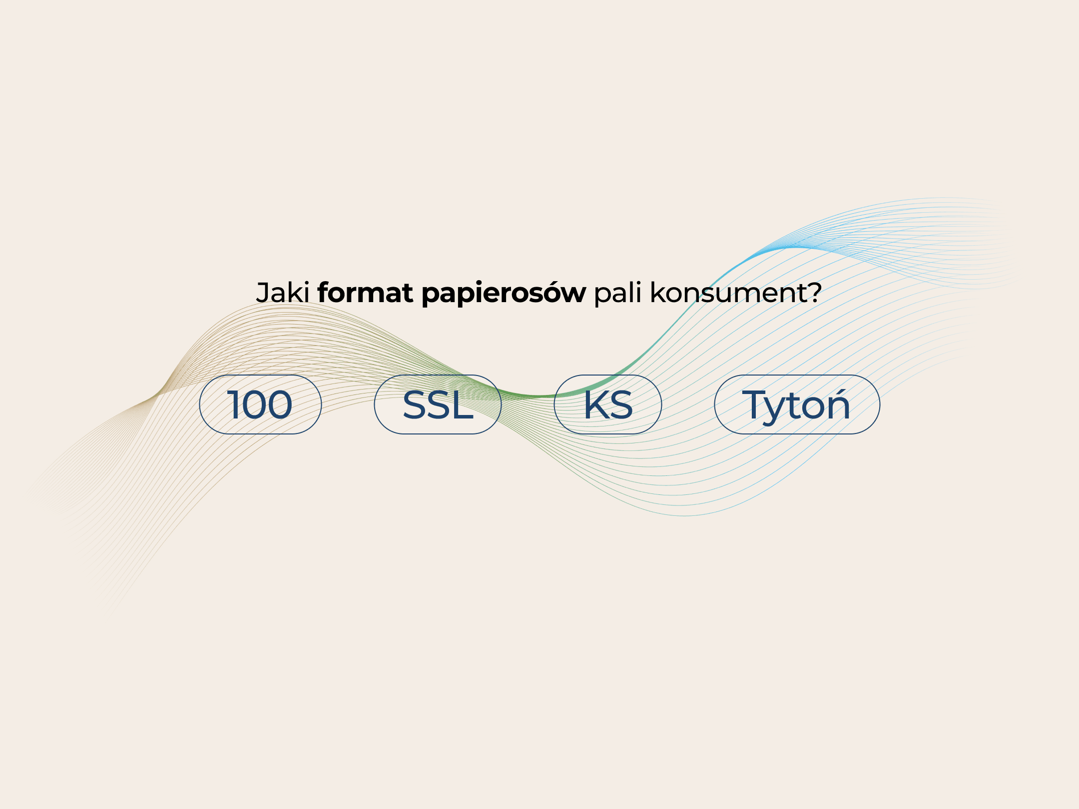
Navbar
The navbar consists of a single semi-transparent bar where each button is aligned. Upon clicking a specific item, a colored indicator smoothly slides towards the selected section, illuminating the background behind the navbar as well. The prototype also includes well-crafted animations that add an elegant, polished feel to the user experience.
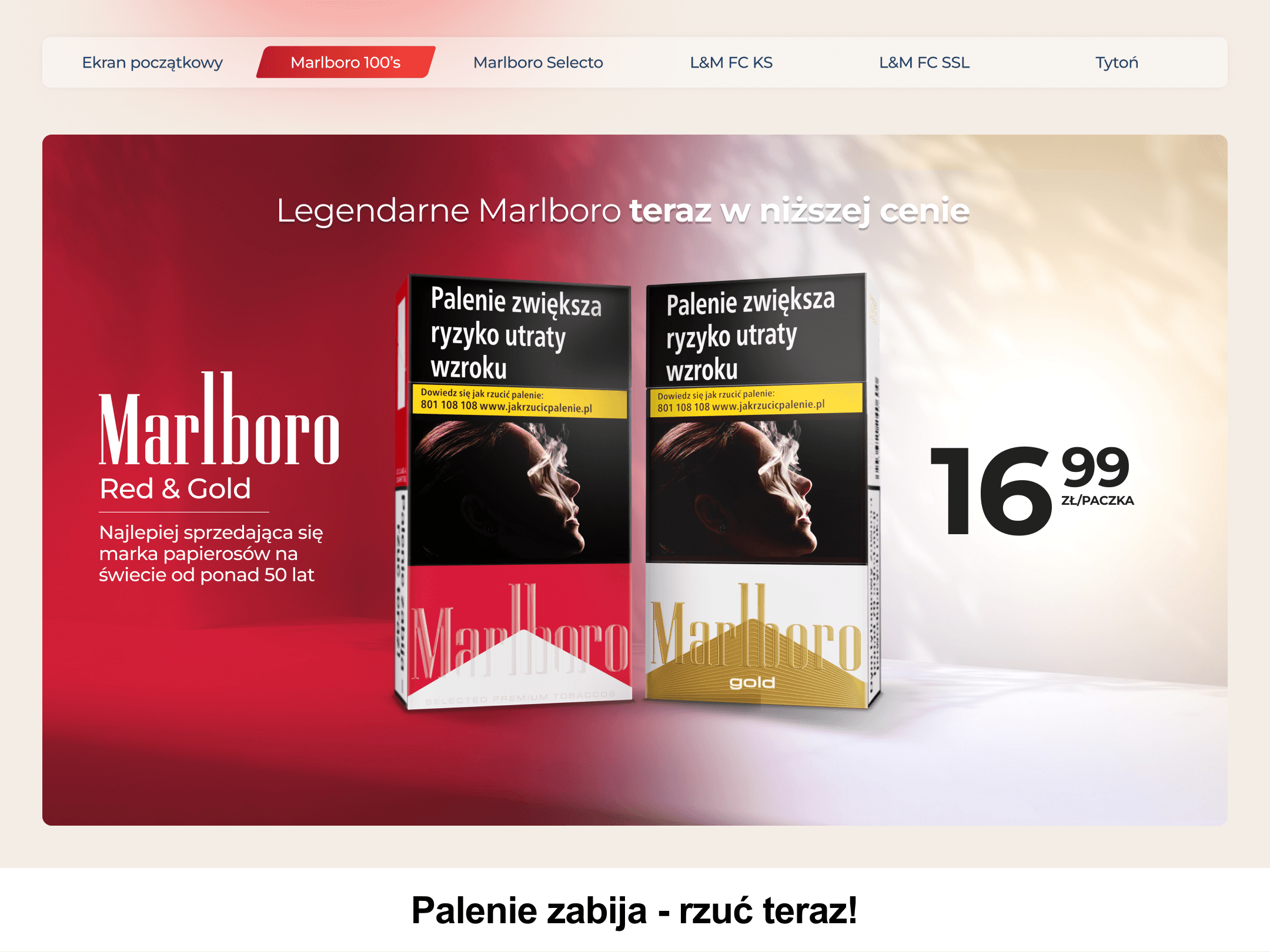
Marlboro 100's
The screen showcases two packs of Marlboro 100’s, representing two distinct product lines. When the user clicks on one of the packs, it zooms in towards them, revealing detailed information about the selected product. These animations create an interactive experience, making the user feel more engaged with the content. The smooth transitions and responsive design enhance the overall user experience, providing a sense of control and fluidity in the interactions.
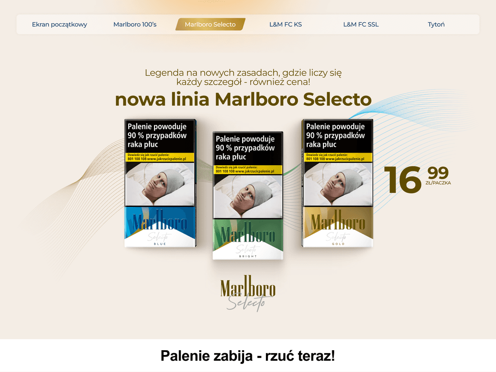
Marlboro Selecto
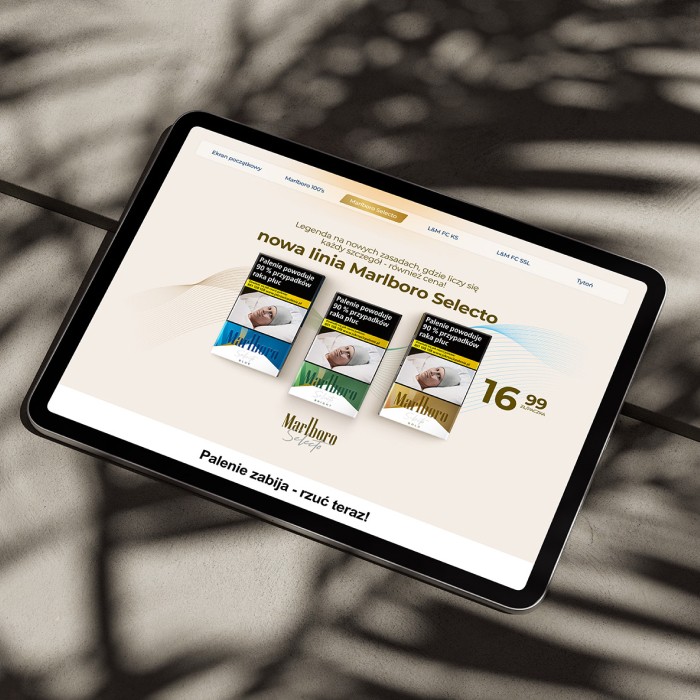
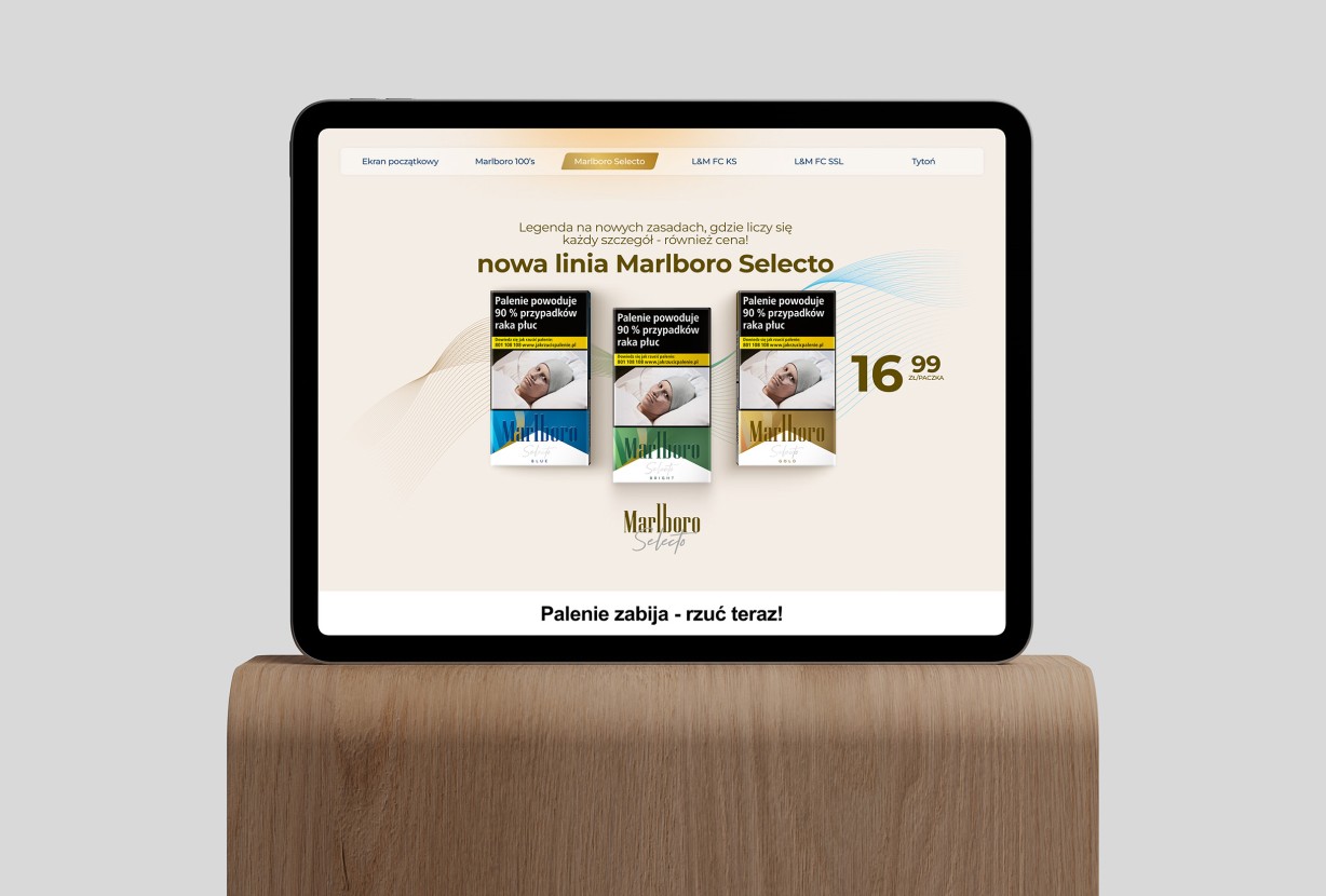
The first screen shows the Marlboro Selecto product line with three packs (Blue, Bright, and Gold) displayed side by side, along with their pricing. The design is clean and minimal, highlighting the products. In the second screen, after clicking on a pack, it zooms in, revealing detailed information about the selected product. The color and details change based on the pack chosen. Smooth, interactive animations focused on organic movements enhance the user experience, making the transitions feel engaging and fluid.
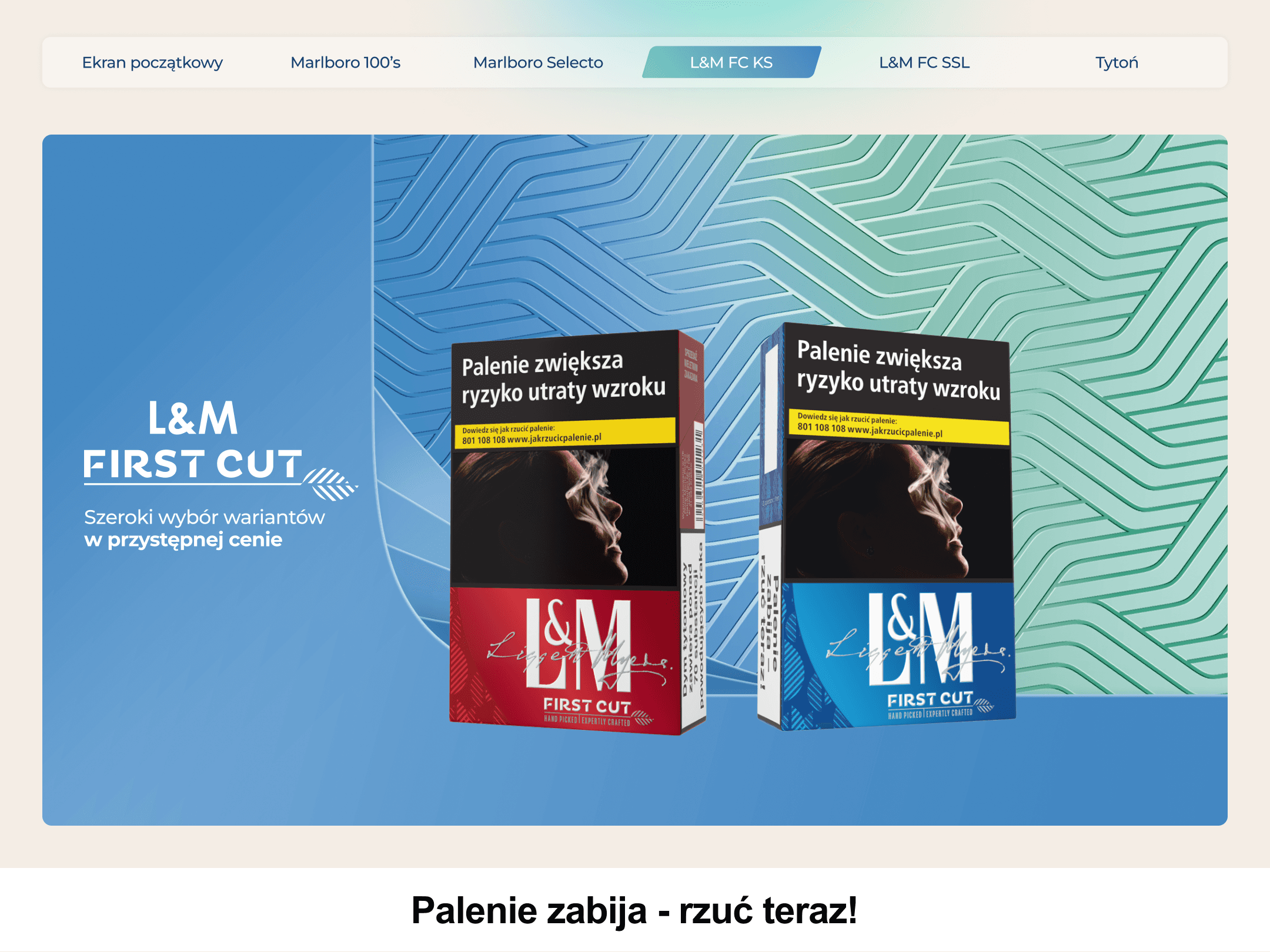
L&M First Cut
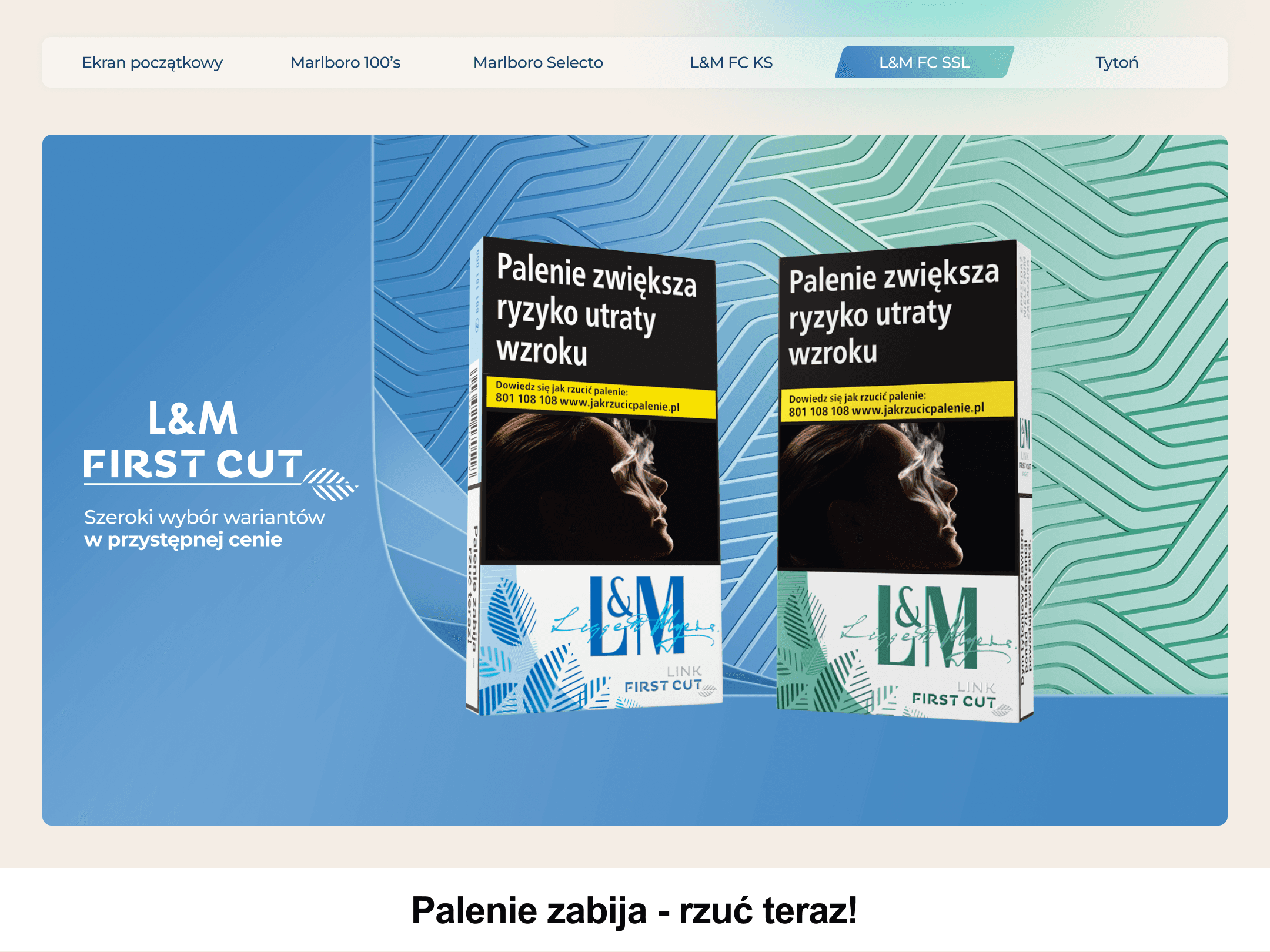
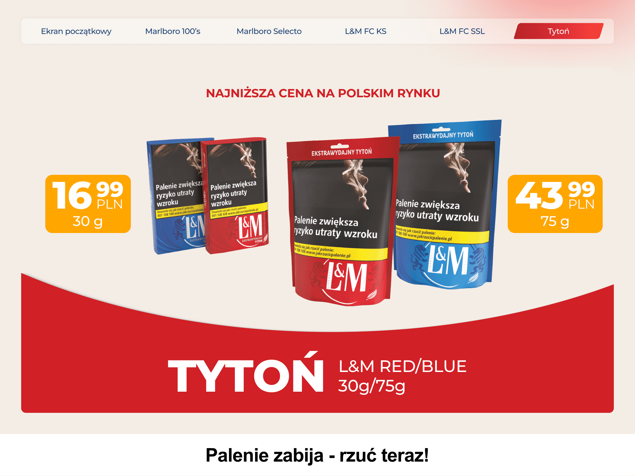
This screen prominently displays large, clear packaging of L&M First Cut cigarettes in the center. Upon clicking on a selected pack, a smooth animation zooms in on the product, highlighting its details and enhancing user interactivity. Additional information about the selected variant appears, providing further engagement. The overall experience feels dynamic and modern, with seamless transitions and subtle animations, creating an intuitive and polished navigation experience.
Transitions
The transitions between screens are based on either swiping left or right or clicking directly on a button in the navbar. These actions trigger smooth horizontal animations that guide the user fluidly between different sections. The subtle left-right motion enhances the overall experience, making navigation feel seamless and intuitive while maintaining a polished, interactive flow throughout the interface.
conclusions
conclusions
conclusions
conclusions
This project was an incredibly engaging experience that allowed me to showcase my prototyping skills and deepen my understanding of interactive app design. Having the opportunity to take a concept from my own ideas directly to the client was rewarding, as it demonstrated my ability to manage and execute the entire process seamlessly. The challenge of creating smooth transitions and a user-friendly interface pushed me to think critically about the finer aspects of interactivity and how they influence the overall user experience.

This project was an incredibly engaging experience that allowed me to showcase my prototyping skills and deepen my understanding of interactive app design. Having the opportunity to take a concept from my own ideas directly to the client was rewarding, as it demonstrated my ability to manage and execute the entire process seamlessly. The challenge of creating smooth transitions and a user-friendly interface pushed me to think critically about the finer aspects of interactivity and how they influence the overall user experience.

This project was an incredibly engaging experience that allowed me to showcase my prototyping skills and deepen my understanding of interactive app design. Having the opportunity to take a concept from my own ideas directly to the client was rewarding, as it demonstrated my ability to manage and execute the entire process seamlessly. The challenge of creating smooth transitions and a user-friendly interface pushed me to think critically about the finer aspects of interactivity and how they influence the overall user experience.

This project was an incredibly engaging experience that allowed me to showcase my prototyping skills and deepen my understanding of interactive app design. Having the opportunity to take a concept from my own ideas directly to the client was rewarding, as it demonstrated my ability to manage and execute the entire process seamlessly. The challenge of creating smooth transitions and a user-friendly interface pushed me to think critically about the finer aspects of interactivity and how they influence the overall user experience.
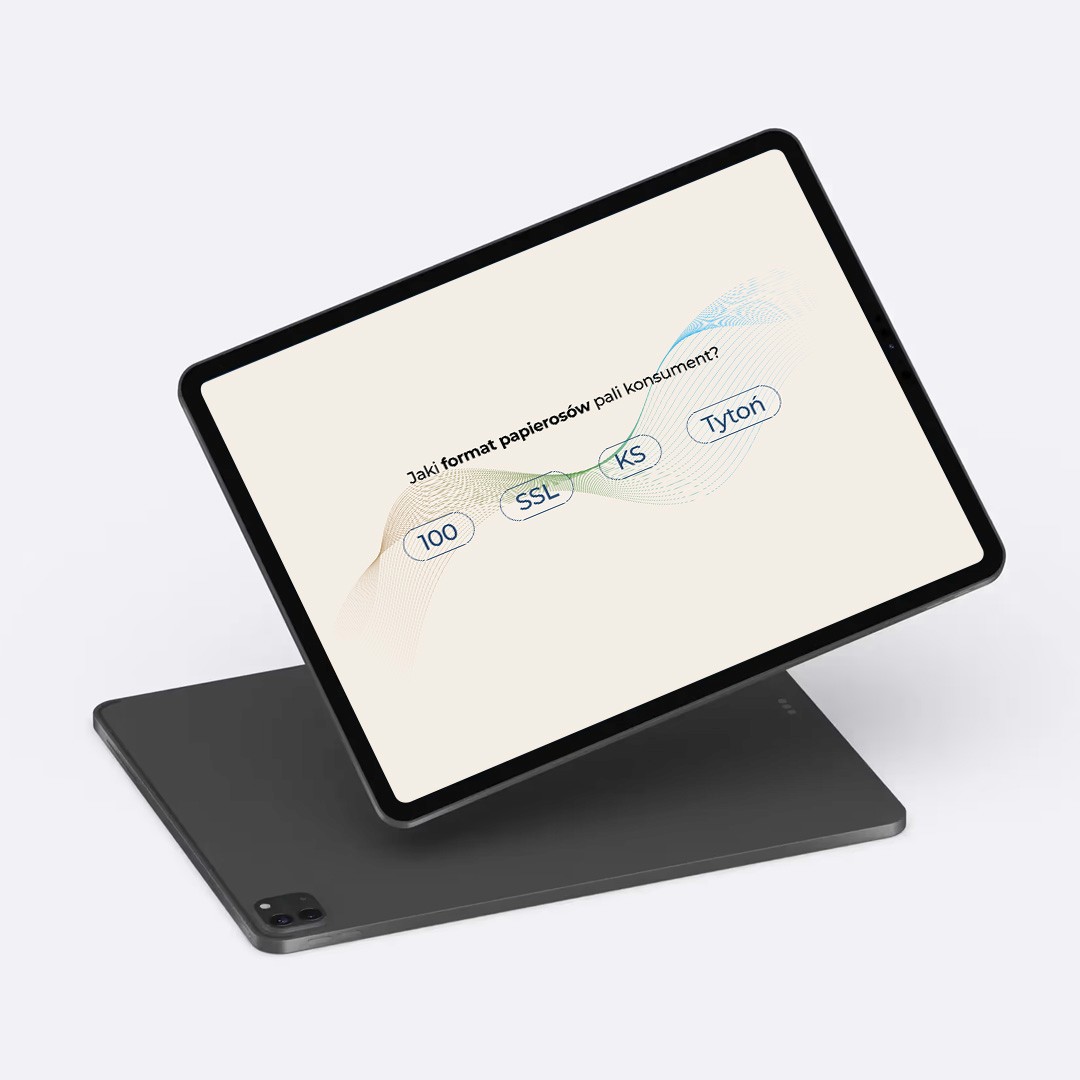
Through this project, I gained significant insights into interaction design, particularly in the area of prototyping, which became an essential part of the development process within the company. By honing my approach, I was able to deliver a polished, fully functional product that met the client’s expectations. The final result was a project that both the client and I were proud of, marking a key achievement in my design journey.

Through this project, I gained significant insights into interaction design, particularly in the area of prototyping, which became an essential part of the development process within the company. By honing my approach, I was able to deliver a polished, fully functional product that met the client’s expectations. The final result was a project that both the client and I were proud of, marking a key achievement in my design journey.
Through this project, I gained significant insights into interaction design, particularly in the area of prototyping, which became an essential part of the development process within the company. By honing my approach, I was able to deliver a polished, fully functional product that met the client’s expectations. The final result was a project that both the client and I were proud of, marking a key achievement in my design journey.

Through this project, I gained significant insights into interaction design, particularly in the area of prototyping, which became an essential part of the development process within the company. By honing my approach, I was able to deliver a polished, fully functional product that met the client’s expectations. The final result was a project that both the client and I were proud of, marking a key achievement in my design journey.
