redefining
numbeo
redefining
numbeo
In a world where data influences our choices, Numbeo is an essential tool for comparing economic conditions across cities. However, its original design often obscured its valuable insights with a cluttered interface.
This case study explores my mission to transform Numbeo into a visually engaging and user-friendly platform. Why? For run, training and research:)
W miastach, gdzie rowery znów stają się coraz bardziej popularne, aplikacja Nextbike ma przed sobą ważne zadanie - przyciągnąć i zaangażować użytkowników, zwłaszcza po trudnym okresie pandemii COVID-19.
Postanowiłem wprowadzić świeży powiew w postaci segmentu gamifikacji, który sprawi, że korzystanie z rowerów stanie się prawdziwą przygodą. Chciałbym, aby każdy użytkownik mógł cieszyć się nie tylko jazdą na rowerze, ale także zdobywaniem nagród i osiągnięć.


category
UX/UI Design
category
UX/UI Design
category
UX/UI Design
type
Personal
type
Personal
type
Personal
software
Figma
Blender
software
Figma
Blender
software
Figma
Blender
timeline
08.2024
timeline
08.2024
timeline
08.2024
about project
about project
Problem
A difficult-to-navigate website presenting highly interesting and useful information for tourists and people relocating.
Solving
Redesign the website to make it more user-friendly and visually appealing.
Numbeo is a portal designed for comparing the economic conditions of various cities, making it easier to decide on your next vacation destination, holiday spot, or even a potential relocation. The data is regularly monitored and updated by the community, ensuring reliability and usefulness.
However, despite the value of the information, the website’s visual design can be off-putting at first glance. I decided to take the initiative and visually (and slightly from a user experience perspective) revamp the entire site to improve its appeal and usability.
main problems
main problems
The main issue with Numbeo lies in its lack of readability—there is virtually no information hierarchy.
Key details on the homepage are crammed into the center, surrounded by distracting text that pulls attention away.
The main issue with Numbeo lies in its lack of readability—there is virtually no information hierarchy.
Key details on the homepage are crammed into the center, surrounded by distracting text that pulls attention away.
Another significant problem is the disorganized layout of elements on the page, giving the impression that they were placed randomly without a clear structure. There’s also a noticeable absence of prominent CTAs that could encourage users to interact with the site.
Another significant problem is the disorganized layout of elements on the page, giving the impression that they were placed randomly without a clear structure. There’s also a noticeable absence of prominent CTAs that could encourage users to interact with the site.
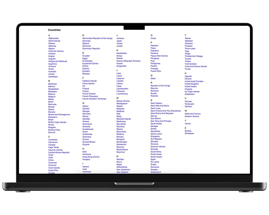
The typography adds to the confusion, with small font sizes and a lack of contrast between more or less important elements, making it difficult for users to navigate from the start.
The typography adds to the confusion, with small font sizes and a lack of contrast between more or less important elements, making it difficult for users to navigate from the start.
The overall visual style feels outdated—the site looks like it was built using good old pure mix of HTML and CSS. On top of that, the weak navigation creates further confusion, preventing users from quickly finding the information they need.
The overall visual style feels outdated—the site looks like it was built using good old pure mix of HTML and CSS. On top of that, the weak navigation creates further confusion, preventing users from quickly finding the information they need.
main rules
main rules
1
Streamline the website by redesigning individual elements and removing unnecessary information.
1
Streamline the website by redesigning individual elements and removing unnecessary information.
2
Design a clear and readable interface.
2
Design a clear and readable interface.
3
Incorporate modern, visually cohesive design.
3
Incorporate modern, visually cohesive design.
solutions
solutions
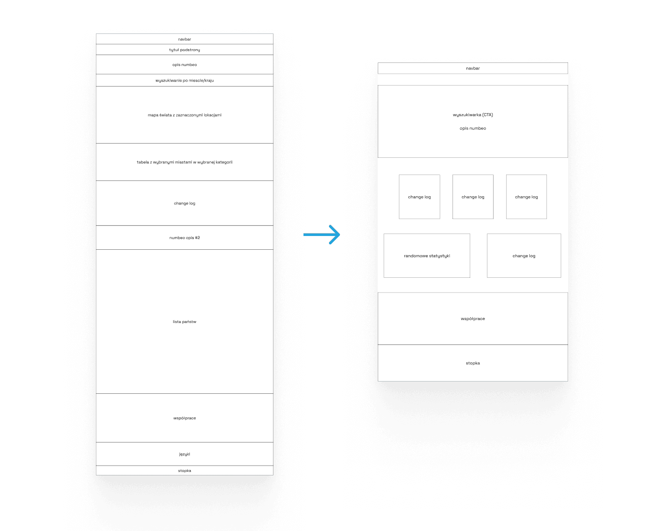
The solution to the problematic lack of hierarchy was to divide the page into key sections and streamline the homepage.

The solution to the problematic lack of hierarchy was to divide the page into key sections and streamline the homepage.
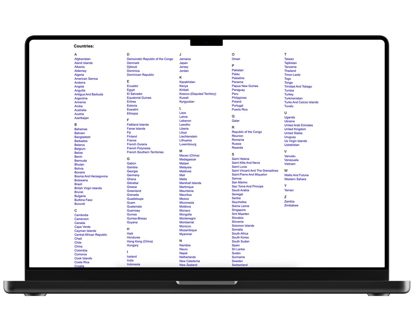
I also implemented text styles that helped establish a unified typographic hierarchy, clearly distinguishing between body text and headings. This significantly improved readability and made the site much more pleasant to browse.

I also implemented text styles that helped establish a unified typographic hierarchy, clearly distinguishing between body text and headings. This significantly improved readability and made the site much more pleasant to browse.
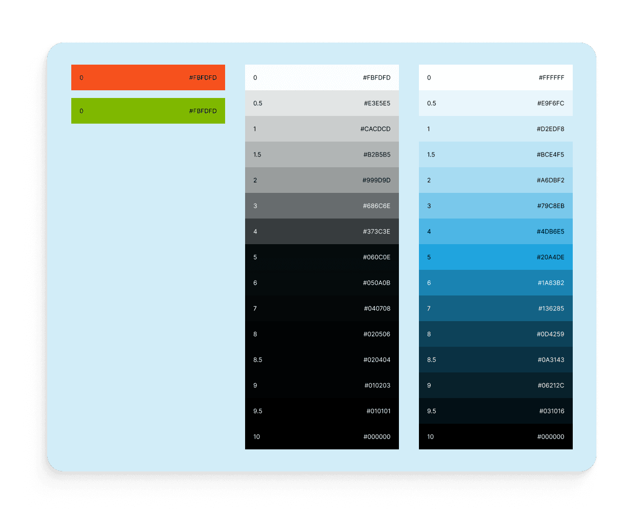
I chose a color palette based on shades of blue from the logo to enhance the overall user experience, giving the site a more modern feel and appearance.

I chose a color palette based on shades of blue from the logo to enhance the overall user experience, giving the site a more modern feel and appearance.
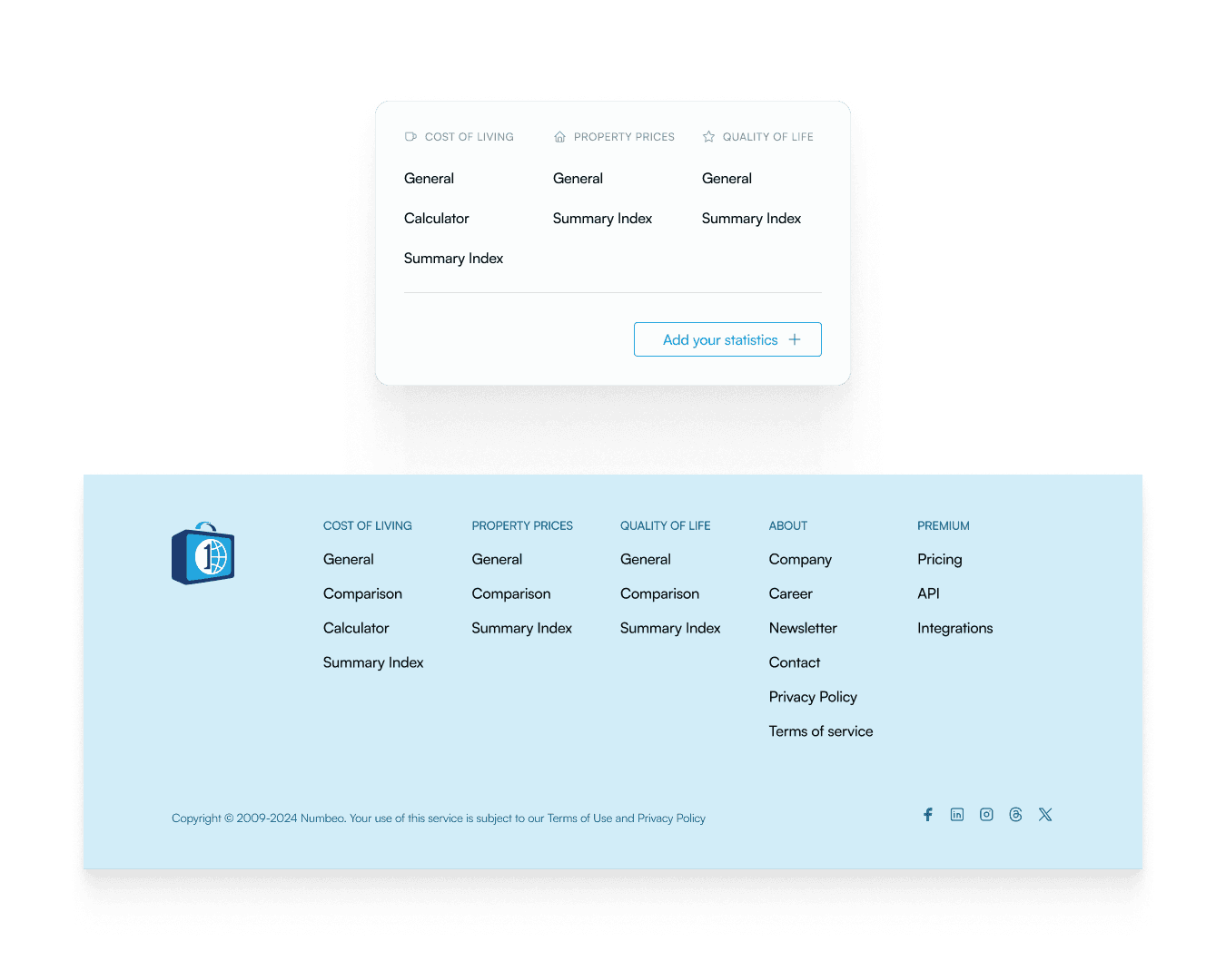
Next, I improved the navigation by removing unnecessary, scattered elements across multiple pages and consolidating them into a unified structure. This shortened the list of pages in the navbar, and I also made the design more consistent by adopting a clean, minimalist style.

Next, I improved the navigation by removing unnecessary, scattered elements across multiple pages and consolidating them into a unified structure. This shortened the list of pages in the navbar, and I also made the design more consistent by adopting a clean, minimalist style.
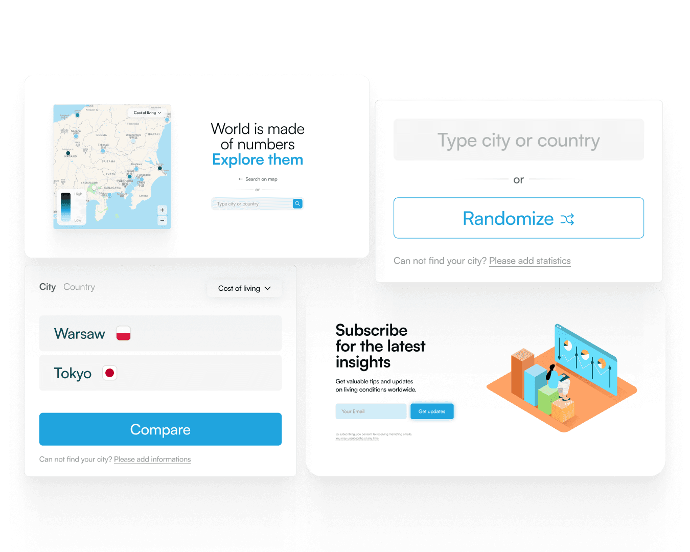
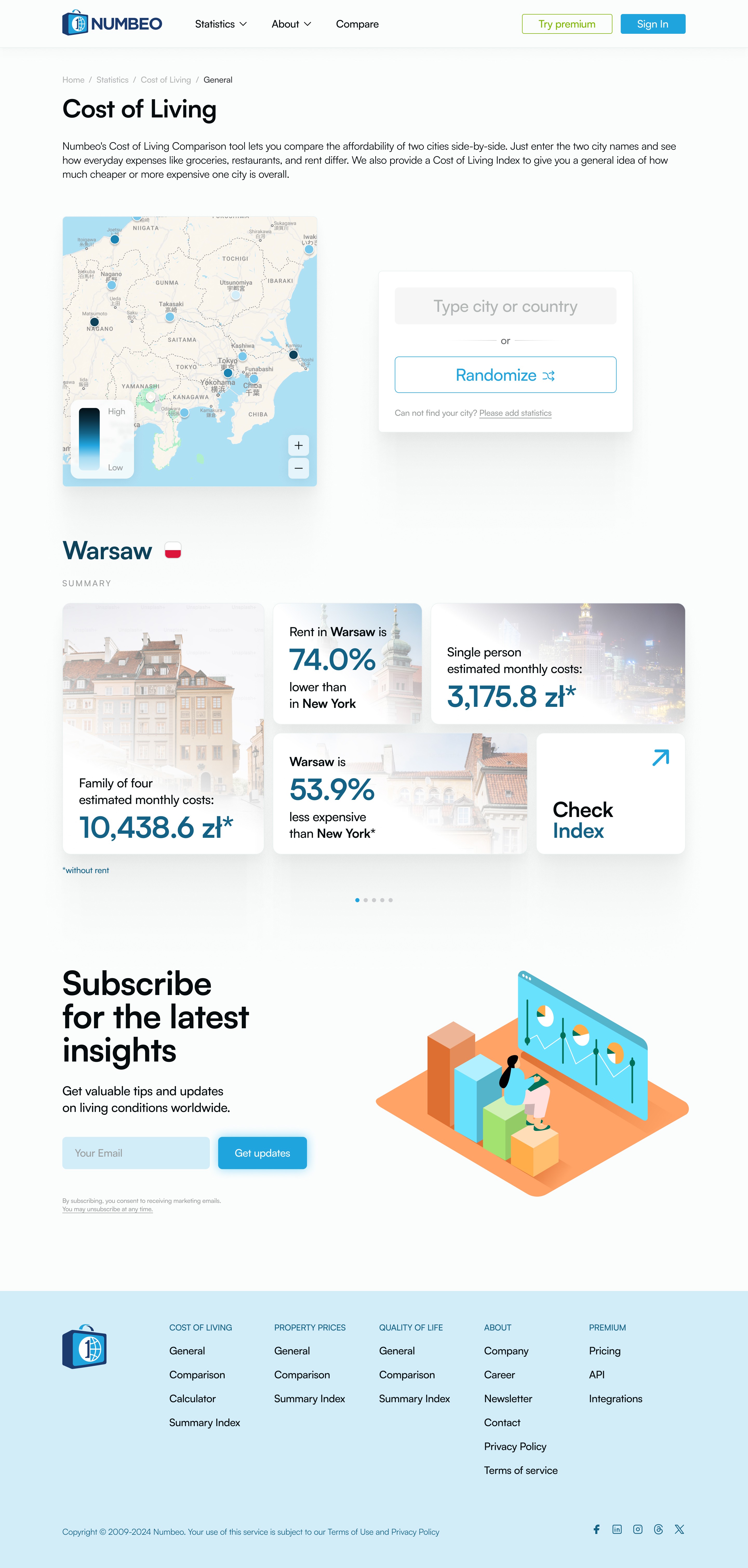
The next step was introducing clear CTAs, guiding users on what actions they can take to stay engaged with the product. The homepage map received a new design, making it more interactive and engaging for users.

The next step was introducing clear CTAs, guiding users on what actions they can take to stay engaged with the product. The homepage map received a new design, making it more interactive and engaging for users.
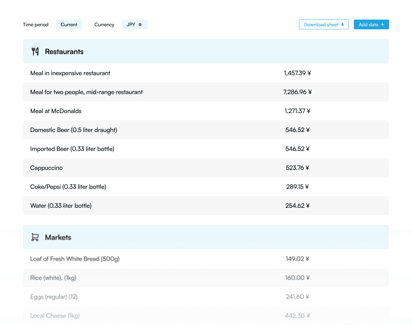
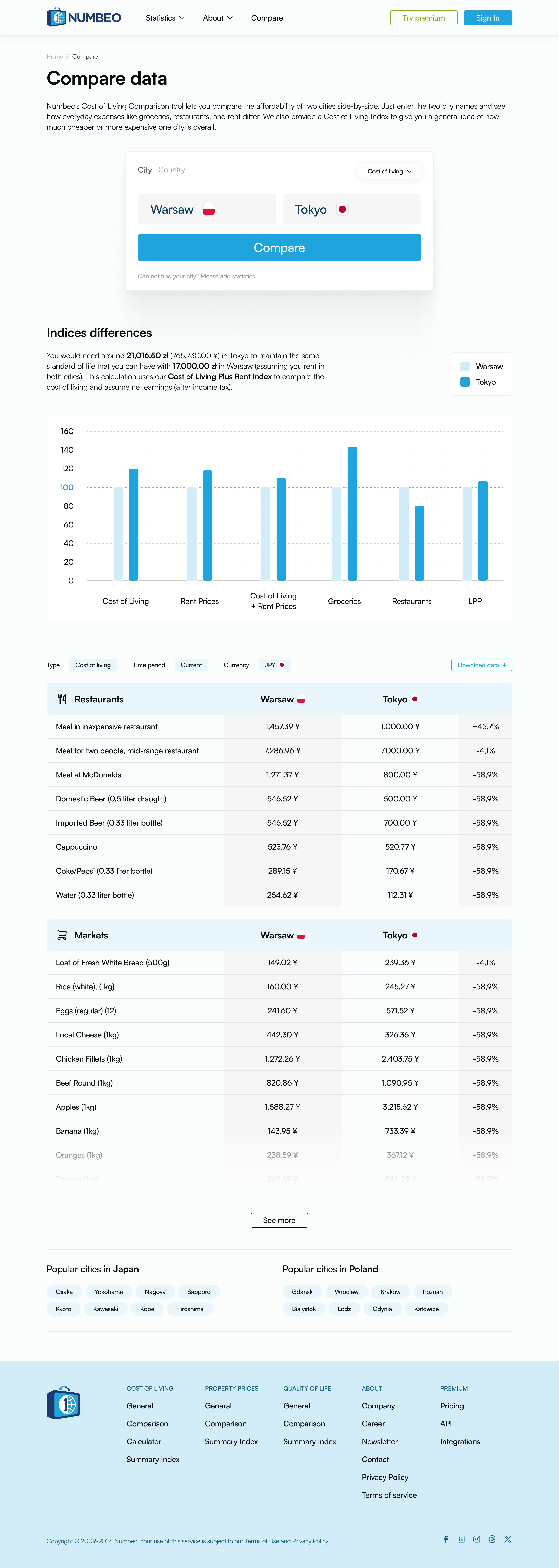
I then redesigned the charts and tables to present data in a cleaner and more visually interesting way, focusing on contrast, color balance, and information hierarchy.

I then redesigned the charts and tables to present data in a cleaner and more visually interesting way, focusing on contrast, color balance, and information hierarchy.
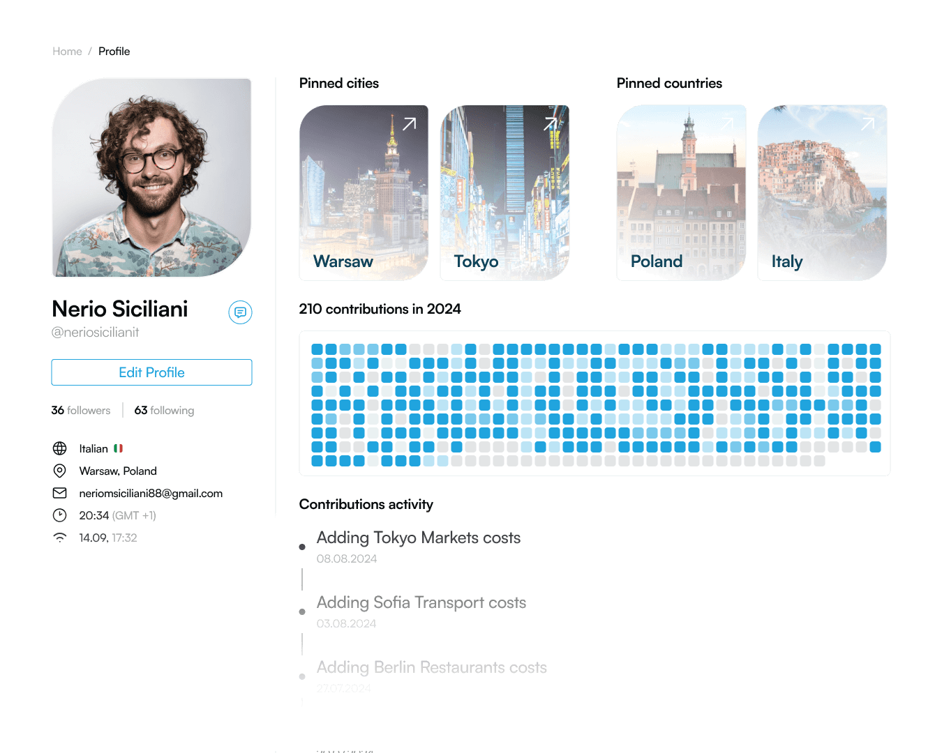
I also refined the user profile section, adding an attractive representation of the user’s contribution to the site’s development.

I also refined the user profile section, adding an attractive representation of the user’s contribution to the site’s development.
final project
final project


conclusions
conclusions
conclusions

This project taught me a lot about the importance of prioritizing functionality and ease of use above all else. Even if Numbeo’s visual design were somewhat clunky, if it adhered to the core principles of good UX, it could still fulfill its purpose effectively.

This project taught me a lot about the importance of prioritizing functionality and ease of use above all else. Even if Numbeo’s visual design were somewhat clunky, if it adhered to the core principles of good UX, it could still fulfill its purpose effectively.

This project taught me a lot about the importance of prioritizing functionality and ease of use above all else. Even if Numbeo’s visual design were somewhat clunky, if it adhered to the core principles of good UX, it could still fulfill its purpose effectively.
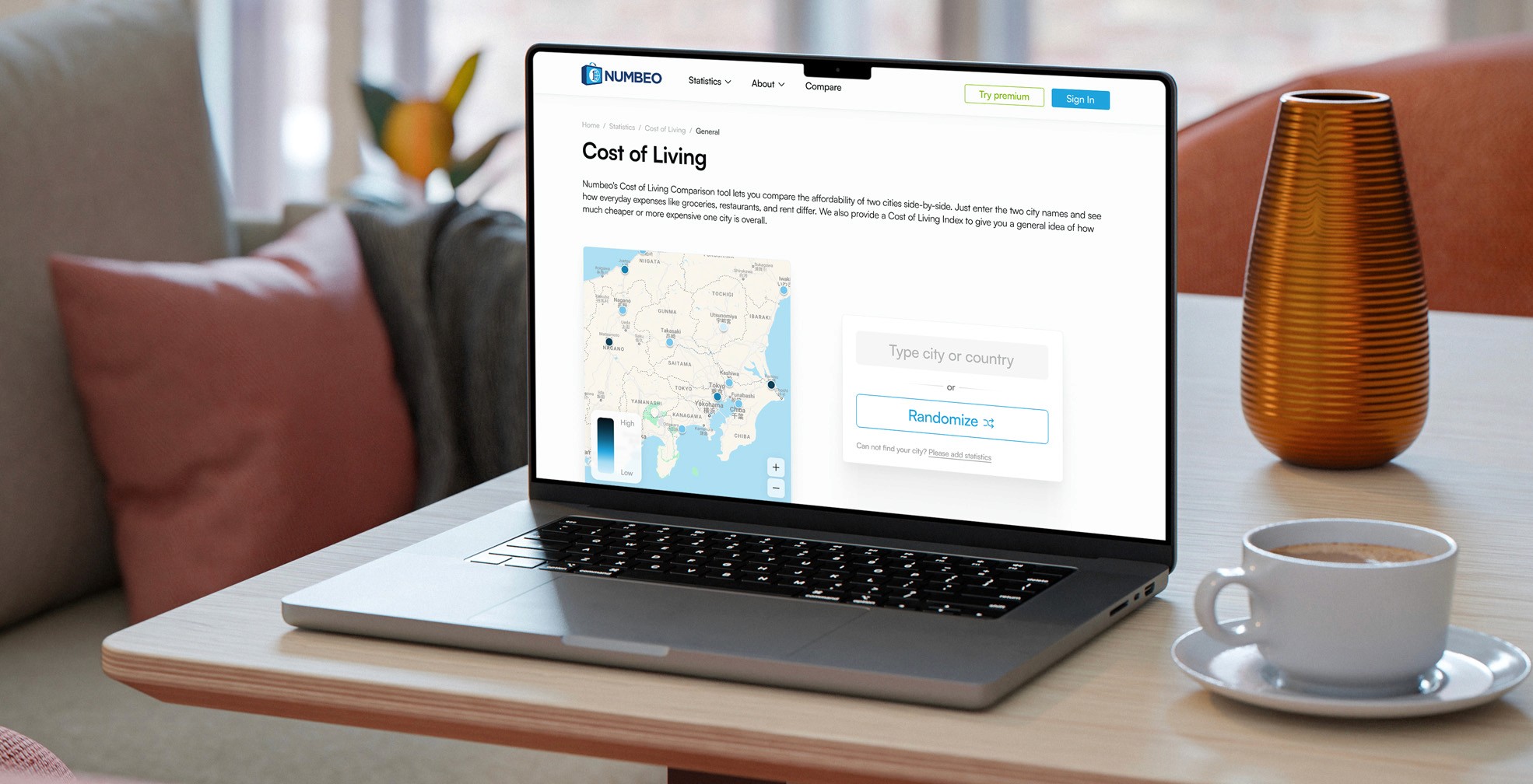
Unfortunately, the original version of the site did more to drive users away from its wealth of valuable information than to engage them. The overwhelming design and poor user flow overshadowed the strong data it had to offer. That’s why I was excited to take on the challenge of refreshing it, giving it a modern look, and streamlining its experience from my own perspective.

Unfortunately, the original version of the site did more to drive users away from its wealth of valuable information than to engage them. The overwhelming design and poor user flow overshadowed the strong data it had to offer. That’s why I was excited to take on the challenge of refreshing it, giving it a modern look, and streamlining its experience from my own perspective.

Unfortunately, the original version of the site did more to drive users away from its wealth of valuable information than to engage them. The overwhelming design and poor user flow overshadowed the strong data it had to offer. That’s why I was excited to take on the challenge of refreshing it, giving it a modern look, and streamlining its experience from my own perspective.
