Next Bike
gamification
Next Bike
gamification
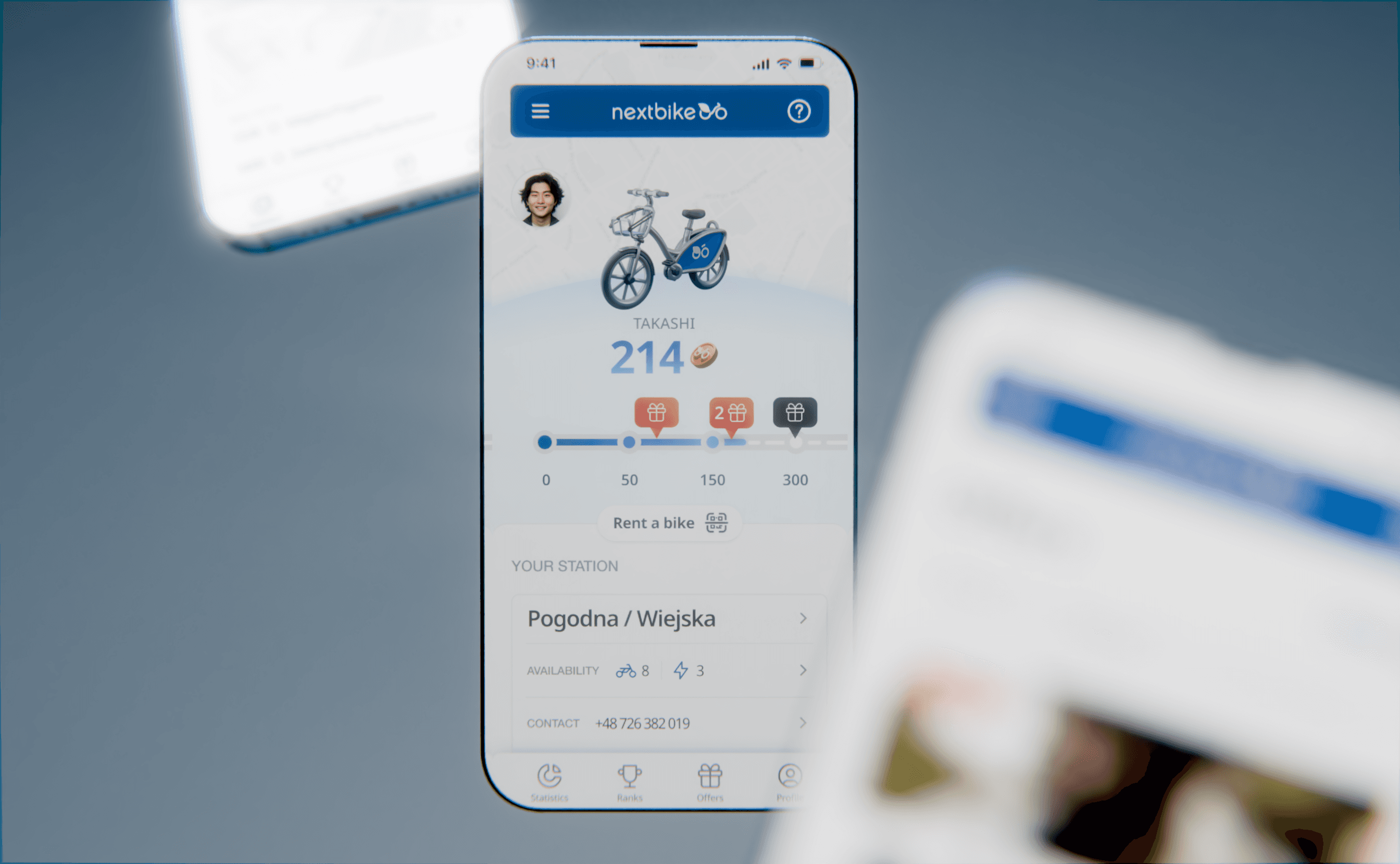
In cities where bicycles are becoming increasingly popular again, the Nextbike app faces an important task – to attract and engage users, especially after the challenging period of the COVID-19 pandemic.
I have decided to introduce a fresh breeze in the form of a gamification segment that will make using bicycles a true adventure. I would like every user to enjoy not only riding a bike but also earning rewards and achievements.


category
UX/UI Design
category
UX/UI Design
category
UX/UI Design
type
Personal
type
Personal
type
Personal
software
Figma
Blender
software
Figma
Blender
software
Figma
Blender
timeline
01-02.2024
timeline
01-02.2024
timeline
01-02.2024
about project
about project
Problem
The difficult period of the COVID-19 pandemic in 2020 caused a decline in interest in the Nextbike app.
Solution
Creating a new segment of the app that encourages people to use it more frequently and rent more bikes.
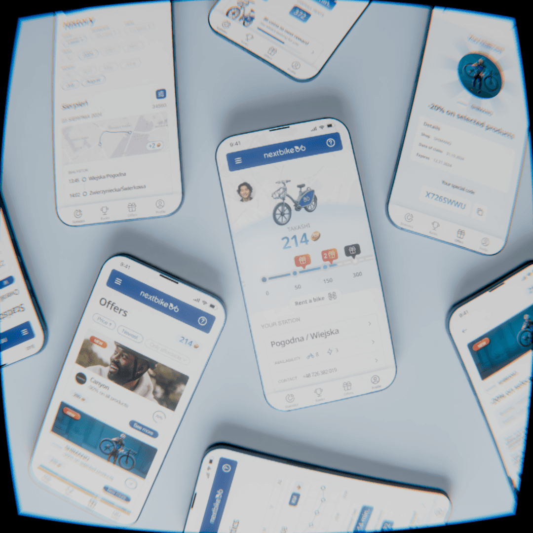

The project introduces a gamification segment to the app. As part of this, each bike rental and the kilometers traveled, as well as other selected activities related to using the service, will be converted into an internal currency. Users will be able to accumulate it and exchange it for attractive rewards and discounts. They will also have the opportunity to track their progress and achievements, which will further increase their motivation to rent bikes regularly.
inspirations
inspirations
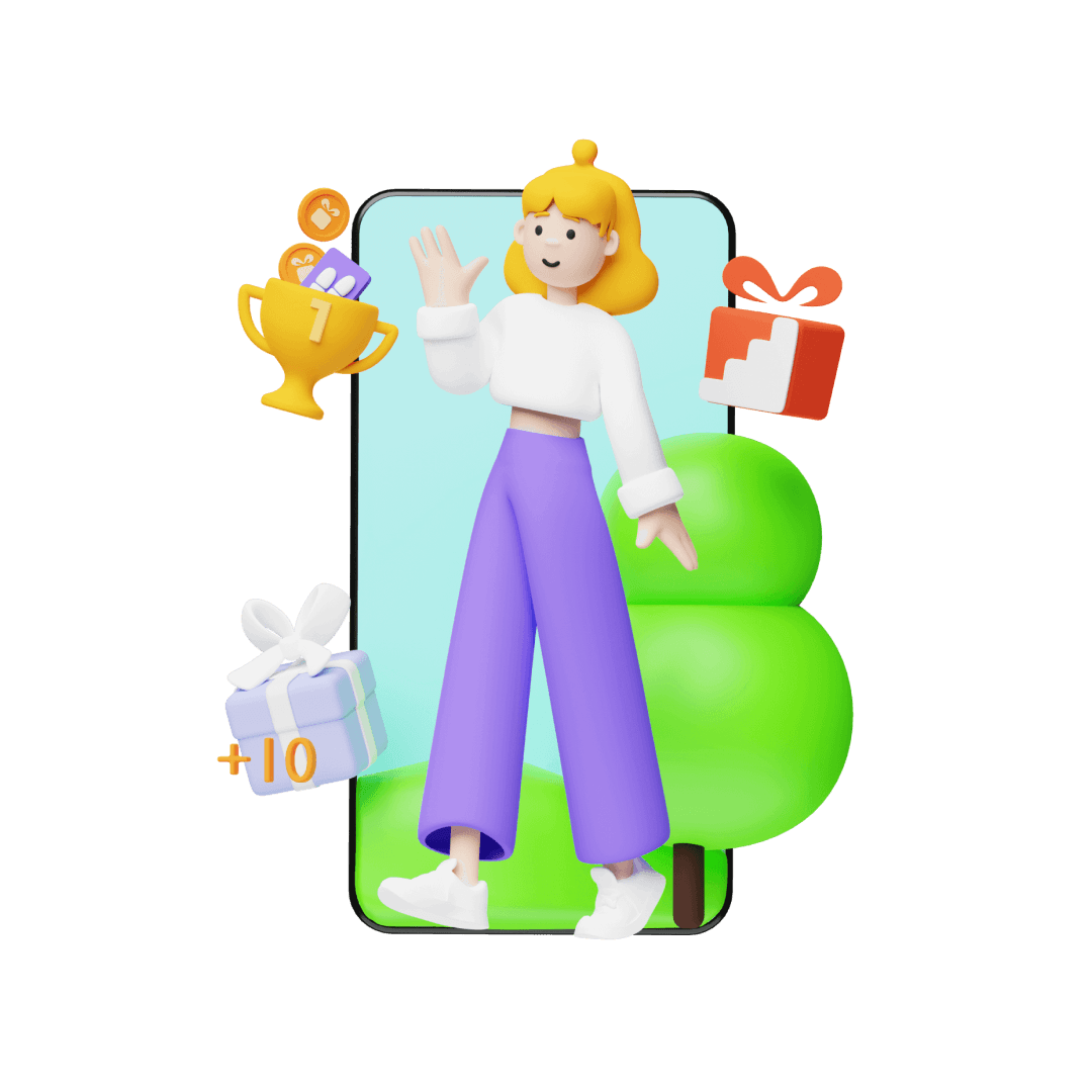
During the design of the segment in the Nextbike app, my main inspiration was the Stepler app, which focuses on motivating users to walk through gamification. What particularly caught my attention about Stepler is its relaxed yet concrete approach to user engagement and the visual clarity of its interface. The app effectively combines game elements with everyday activities, making its use a genuine pleasure.

During the design of the segment in the Nextbike app, my main inspiration was the Stepler app, which focuses on motivating users to walk through gamification. What particularly caught my attention about Stepler is its relaxed yet concrete approach to user engagement and the visual clarity of its interface. The app effectively combines game elements with everyday activities, making its use a genuine pleasure.
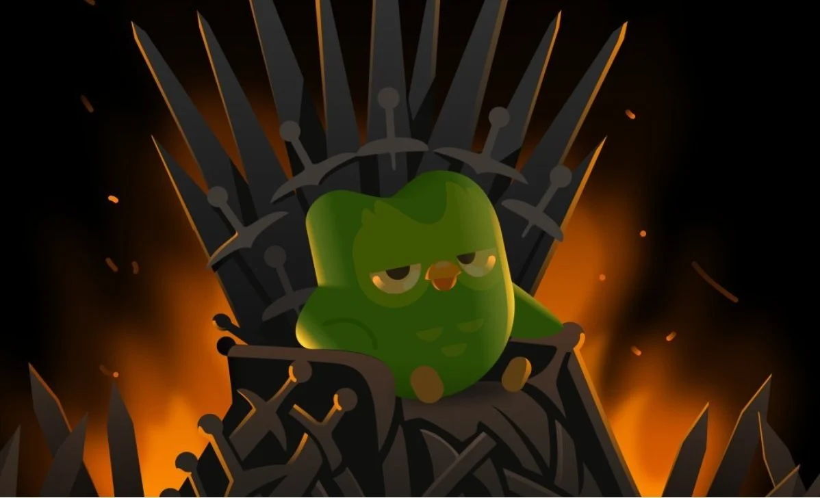
The second significant source of inspiration was Duolingo, which is an excellent example of applying gamification in language learning. Thanks to engaging game mechanics, users are encouraged to practice regularly, which translates into their progress.

The second significant source of inspiration was Duolingo, which is an excellent example of applying gamification in language learning. Thanks to engaging game mechanics, users are encouraged to practice regularly, which translates into their progress.
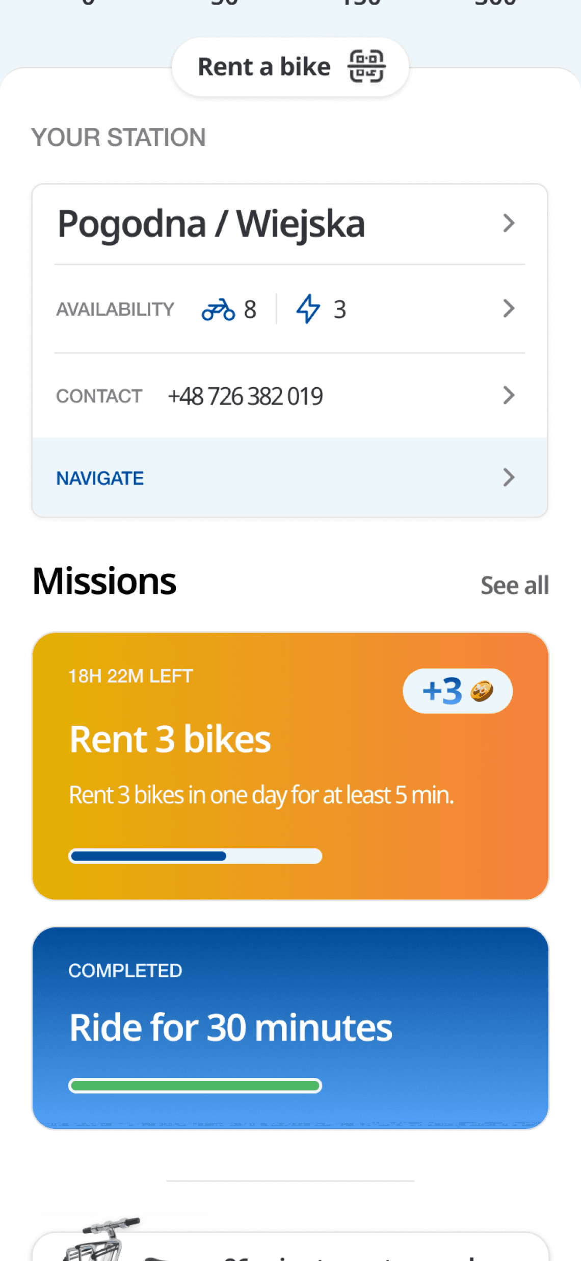
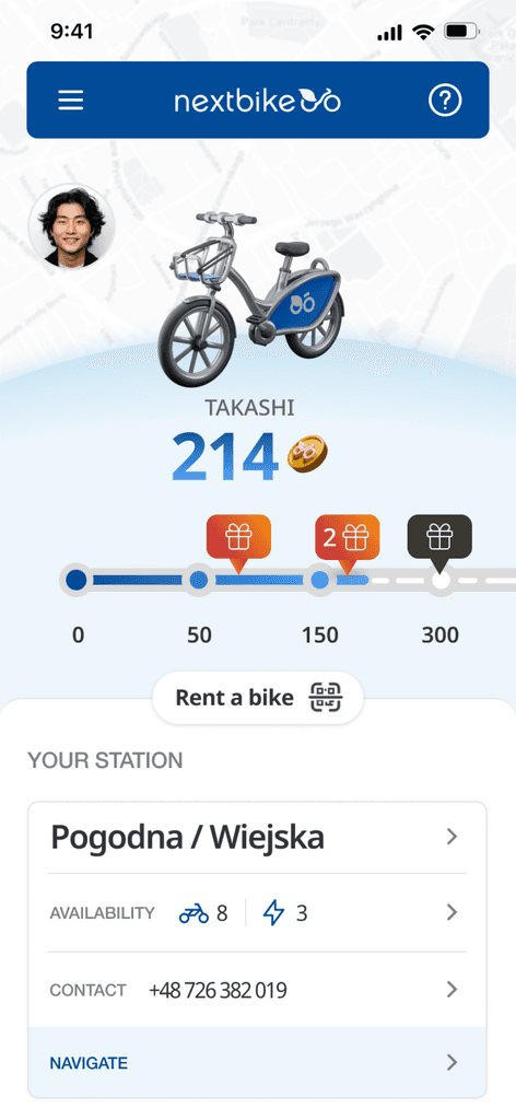
In my project, I applied selected game mechanics, such as a progress map that is featured on the app's main screen. This kind of visualization allows users to track their achievements and progress in real-time, which increases their engagement. The progress map serves not only as a motivational tool but also as a visual representation of users' journeys, encouraging them to set and achieve new goals. By seeing their advancements laid out clearly, users are more likely to stay committed and continue using the app regularly.

In my project, I applied selected game mechanics, such as a progress map that is featured on the app's main screen. This kind of visualization allows users to track their achievements and progress in real-time, which increases their engagement. The progress map serves not only as a motivational tool but also as a visual representation of users' journeys, encouraging them to set and achieve new goals. By seeing their advancements laid out clearly, users are more likely to stay committed and continue using the app regularly.
main rules
main rules
1
Designing a segment that incorporates elements to maximally engage the user.
1
Designing a segment that incorporates elements to maximally engage the user.
2
Maintaining a clean, clear layout that visually aligns with the main part of the app.
2
Maintaining a clean, clear layout that visually aligns with the main part of the app.
3
Creating a gamification segment that serves as an attractive enhancement rather than an obstacle to using the app.
3
Creating a gamification segment that serves as an attractive enhancement rather than an obstacle to using the app.
user flow
user flow

final project
final project
Home
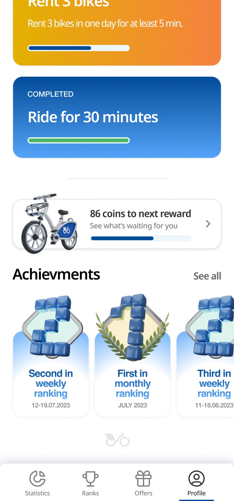
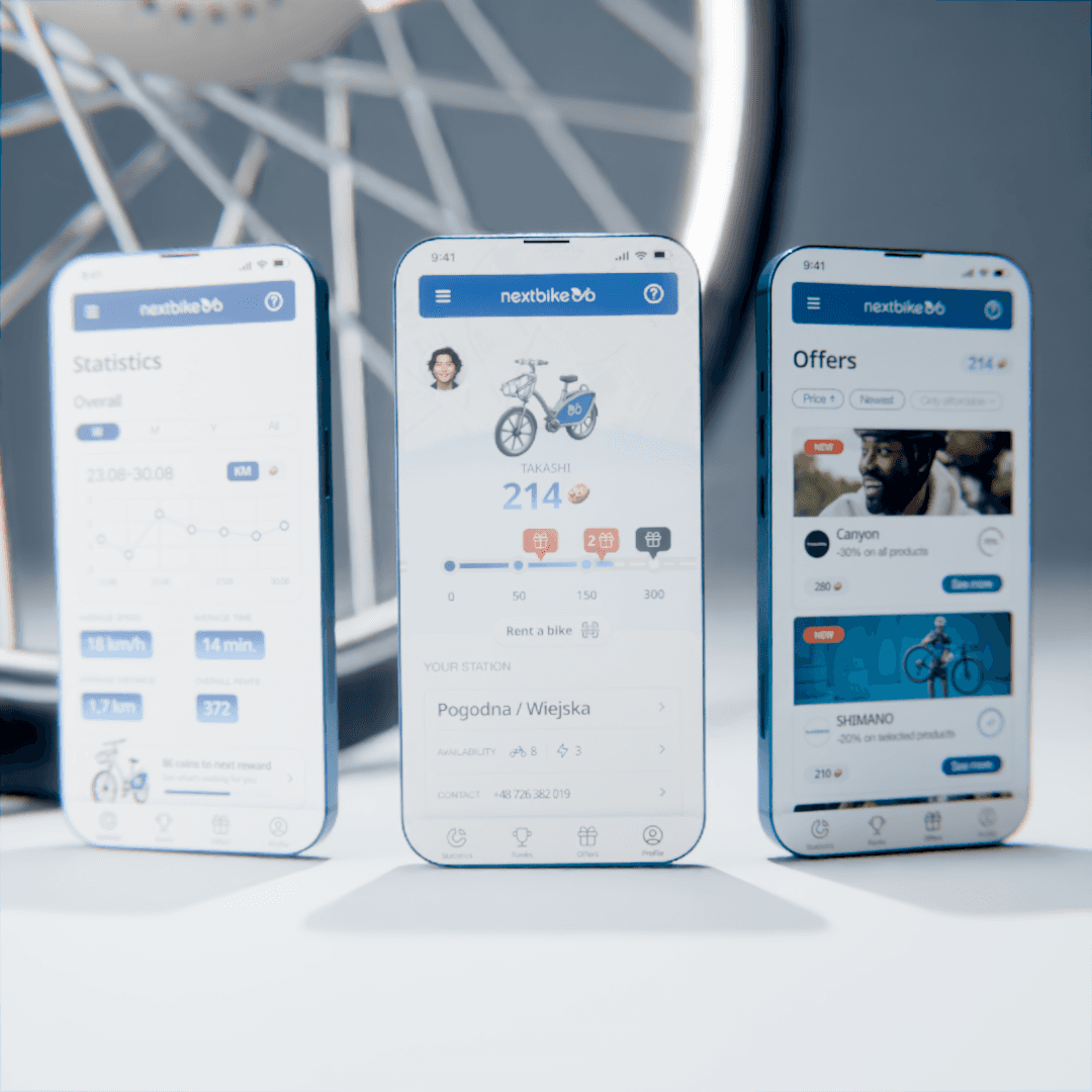
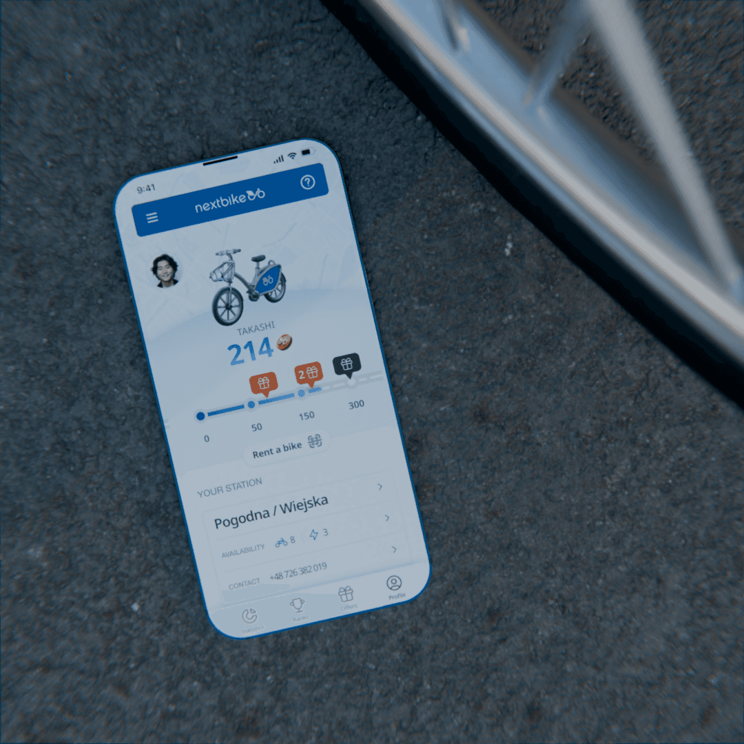
The profile screen in the app, which also serves as the home screen, has been designed with user intuitiveness and engagement in mind. It combines elements of gamification (progress map) with functionality (direct bike rental), which translates to a positive user experience. The main screen additionally provides access to missions and badges, further motivating users to regularly engage with the app.

Statistics
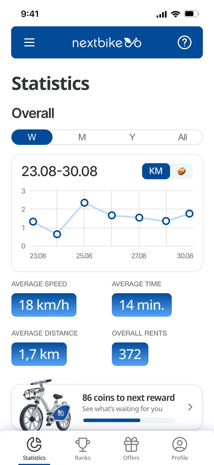
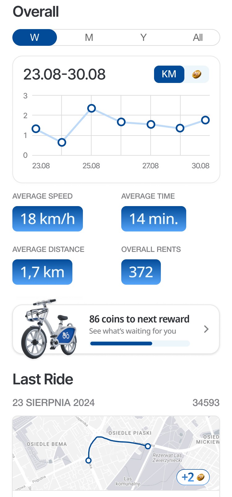
This screen provides users with an overview of their cycling activity, presented in a clear and engaging manner. Users can toggle between different time frames (weekly, monthly, yearly, or all time) to view their performance data. The main graph visualizes key statistics like distance traveled, with the ability to switch between kilometers and coins earned. Below the graph, additional metrics are displayed, such as average speed, average ride time, average distance per ride, and the total number of rides. A reward progress bar at the bottom shows how many coins are needed to unlock the next reward, motivating continued engagement with the app.

Rank
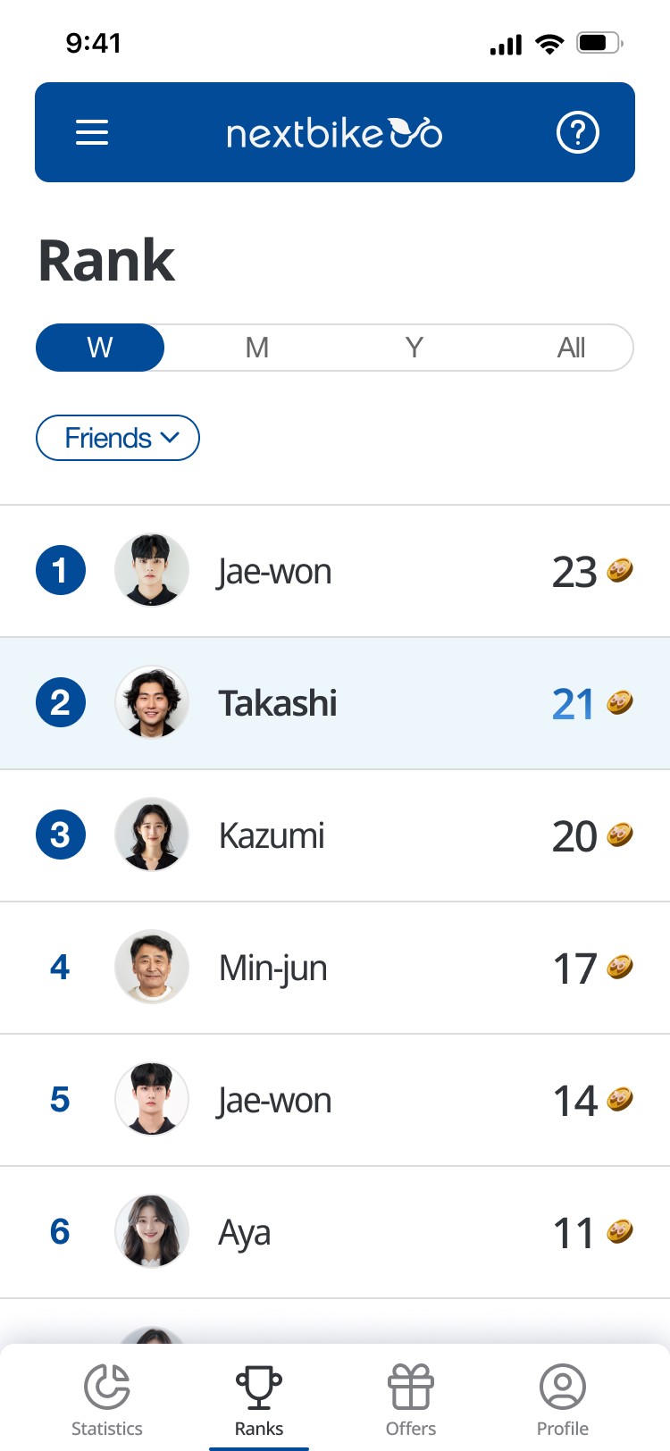
The user ranking screen fosters competition and community among users. It features a dynamic table displaying user scores, with a time filter allowing users to view rankings weekly, monthly, yearly, or all-time. This encourages tracking progress over different periods. Additionally, the friend filter lets users compare their scores with those in their social circle, enhancing engagement. Users can easily locate their profiles, highlighted in a soft blue color, ensuring quick recognition of their achievements. Overall, this screen effectively combines functionality with an engaging experience, motivating users to participate actively while staying connected with friends.

Offers
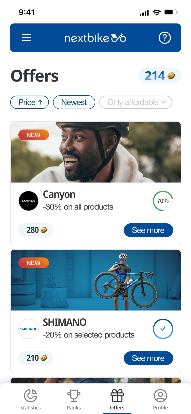
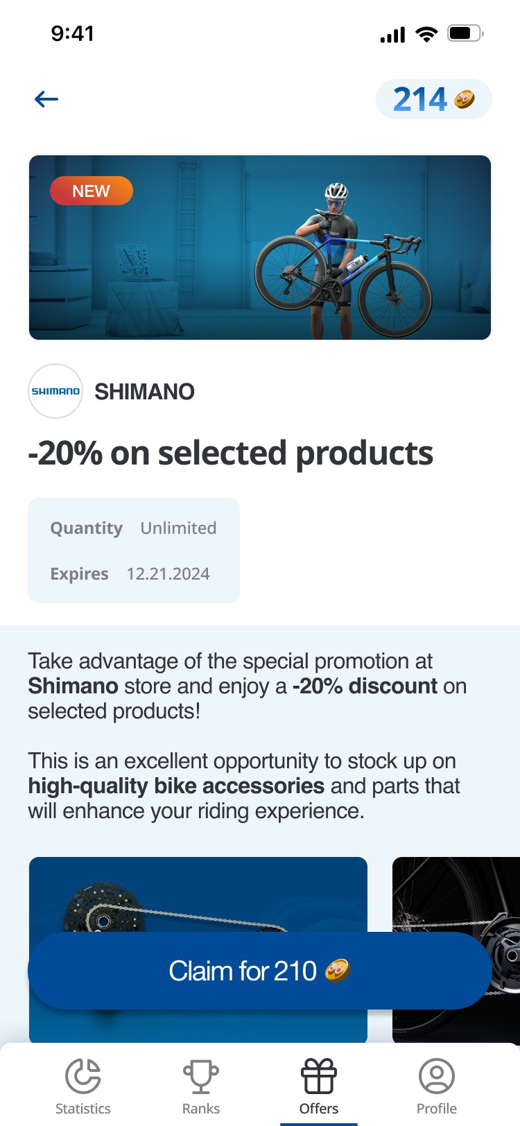
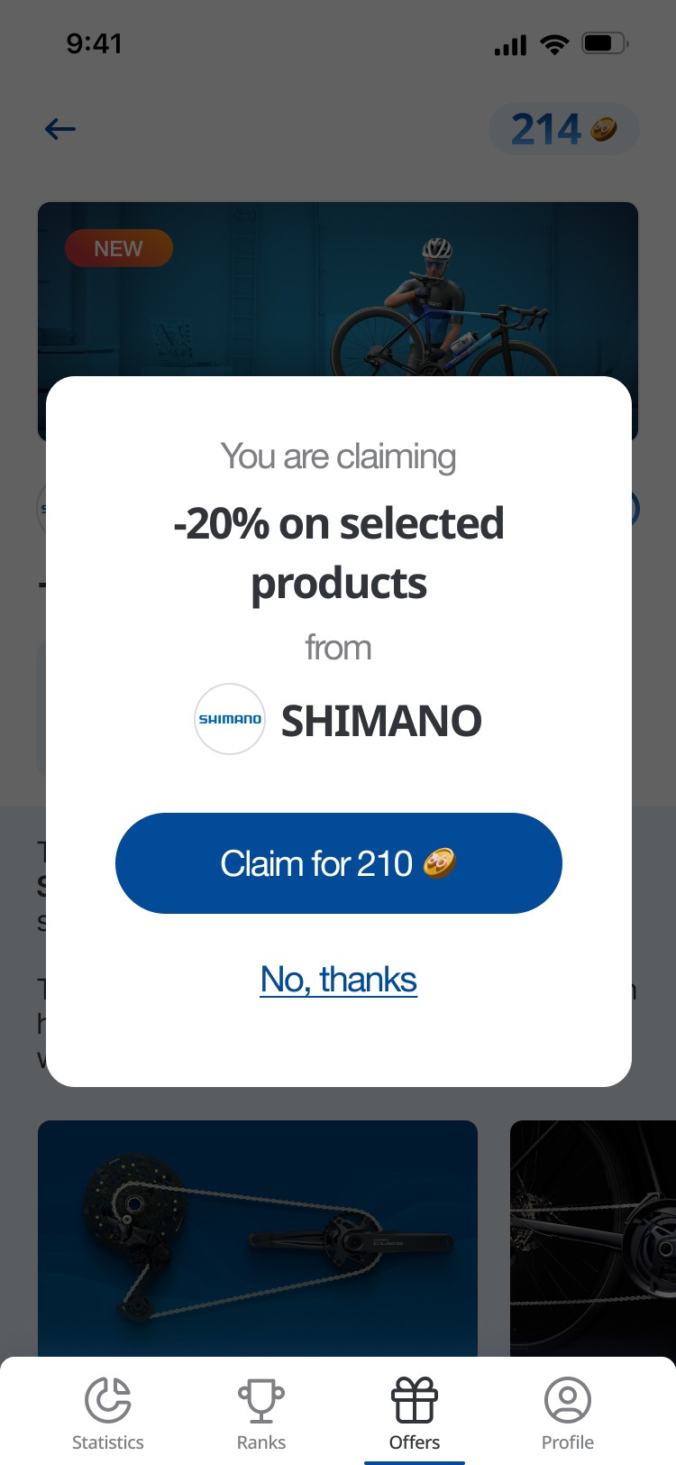
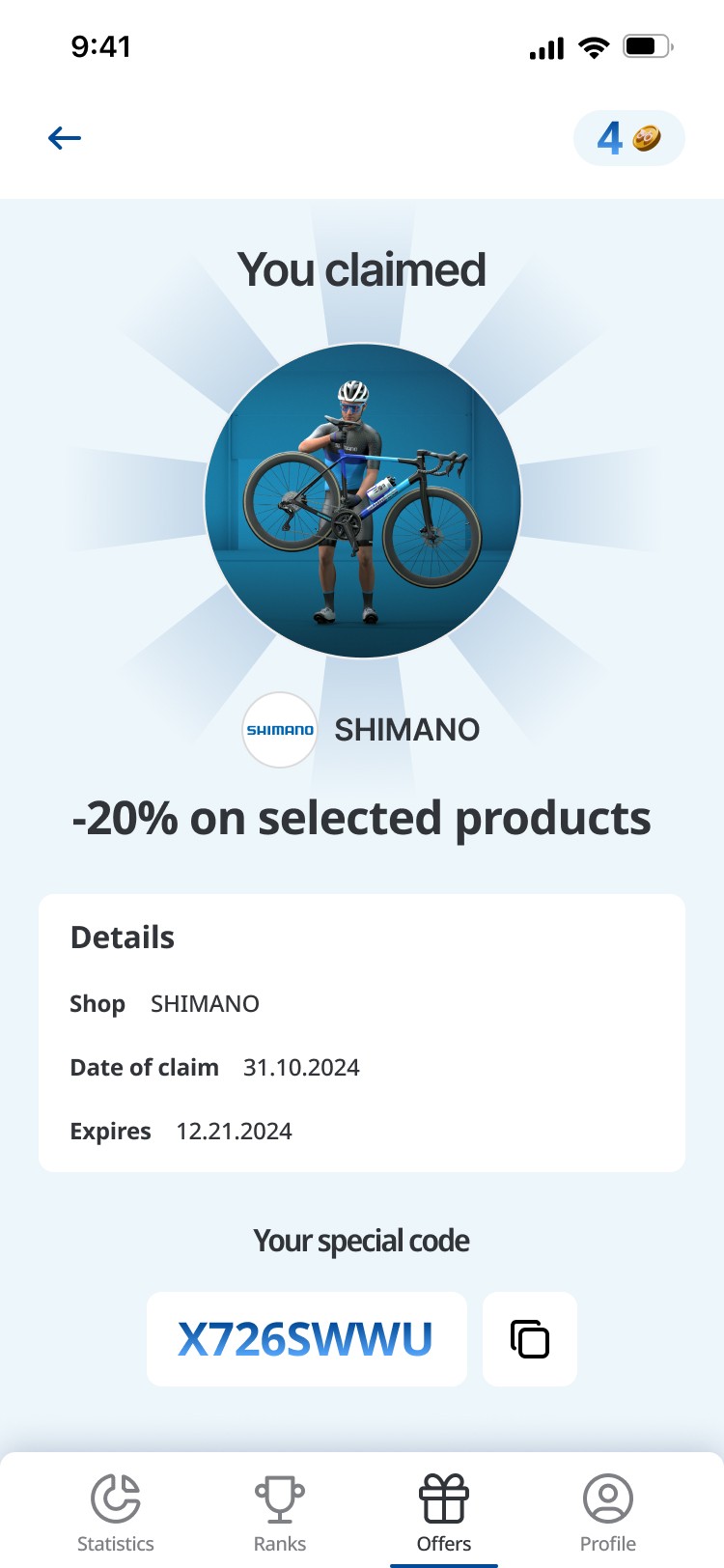
This screen in the Nextbike app is designed to present users with cycling-related promotions in a clean and engaging way. Users can filter offers by price, newest arrivals, and affordability, making navigation simple and intuitive. Each offer is displayed as a card with key details such as the brand name, discount percentage, and a product image. A “NEW” label highlights recently added offers, and some cards include a progress indicator showing how close the user is to unlocking a reward. A “See more” button is placed on each offer, encouraging users to explore further.

History
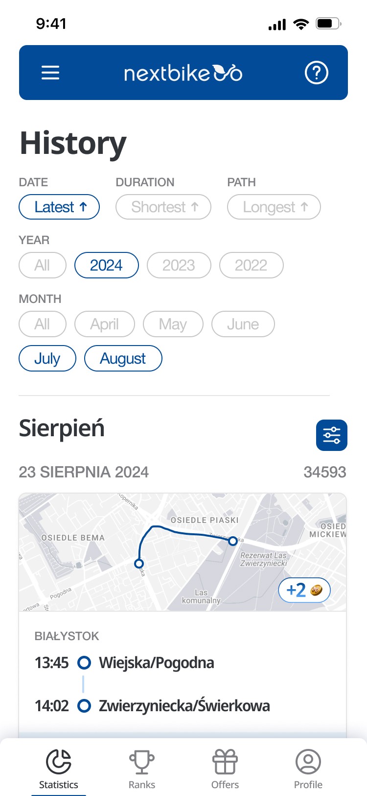
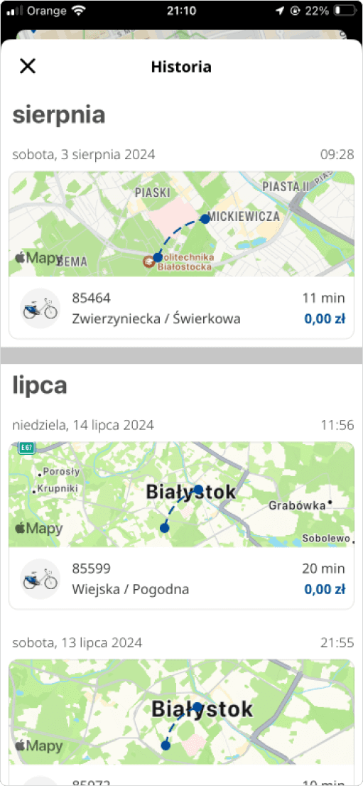
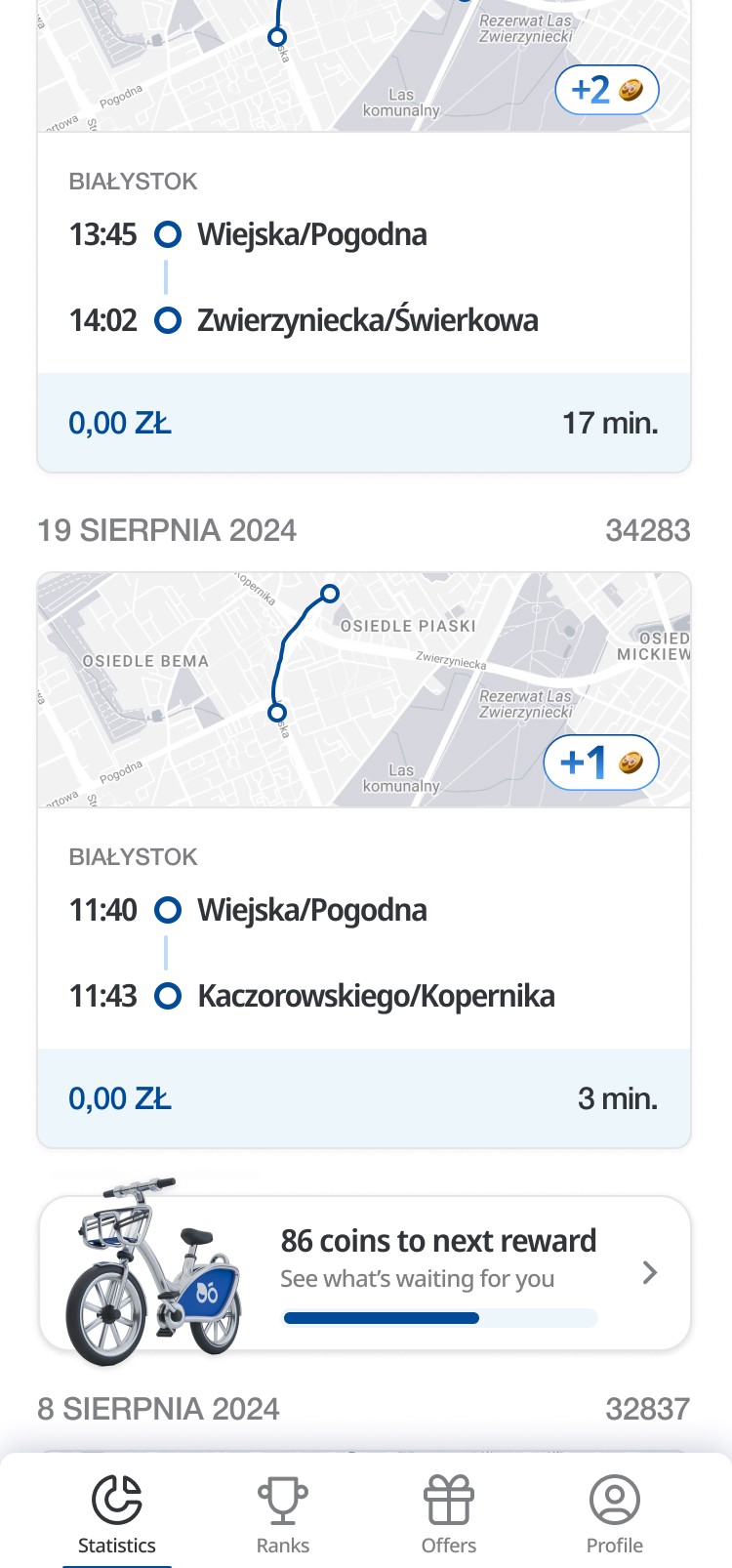
This screen allows users to review their past bike rentals, with sorting options for date, duration, and path length. Users can filter the history by year and month, making it easy to navigate through their riding records. Each ride is presented with a detailed map of the route, the start and end times, locations, duration, cost, and coins earned. Notably, the ride card has been redesigned into a more transparent version, enhancing clarity. This detailed breakdown helps users track their progress and rewards, enhancing transparency and encouraging engagement with the app’s gamification system.
favorite details
favorite details
favorite details
3D Elements
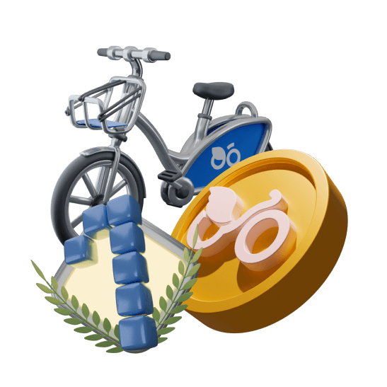
In this project, I designed several key elements, including the nextbike bicycle, the nextCOIN system, and achievement badges. These components not only enhance the functionality of the application but also contribute to a cohesive user experience. The bicycle design reflects modern aesthetics and practicality, while the nextCOIN system promotes user engagement through a rewarding mechanism. Additionally, the achievement badges serve as motivational tools, encouraging users to explore and utilize the app more frequently.
Last ride card
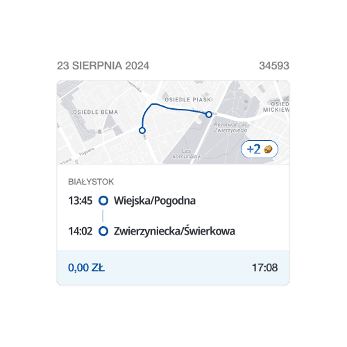
This card is a sleek, minimalist interface element that revitalizes the entire ride history screen, making it more visually appealing. It presents essential details like the date, start and end times, ride duration, and cost, along with the ride's position in the user's journey. A dynamic map illustrates the route taken, adding a delightful visual flair. Additionally, it showcases the number of nextCOINs earned, transforming the experience into something both informative and engaging. This thoughtful design breathes new life into the ride history, creating a more enjoyable and inviting space for users to explore their adventures.

Current version
Current version
Current version
My version
My version
My version

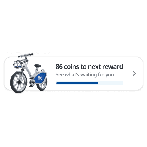
Progress card
The Progress Card for the nearest reward is a dynamic element that keeps users motivated by showing how many nextCOINs are left to earn before claiming their next prize. With a clear CTA and an arrow directing users to the rewards screen, it creates a seamless pathway to their rewards. This design not only enhances user engagement but also adds an exciting sense of anticipation, making the journey toward rewards feel like a thrilling adventure!

conclusions
conclusions
conclusions
Through this project, I faced the challenge of modernizing an existing design that had not kept pace with current standards. By carefully adapting the nextbike brand and application, I aimed to create a fresh aesthetic that aligns with contemporary user expectations while maintaining brand consistency. This balance was crucial in ensuring that the application feels both familiar and innovative, enhancing user trust and satisfaction.

Through this project, I faced the challenge of modernizing an existing design that had not kept pace with current standards. By carefully adapting the nextbike brand and application, I aimed to create a fresh aesthetic that aligns with contemporary user expectations while maintaining brand consistency. This balance was crucial in ensuring that the application feels both familiar and innovative, enhancing user trust and satisfaction.

Through this project, I faced the challenge of modernizing an existing design that had not kept pace with current standards. By carefully adapting the nextbike brand and application, I aimed to create a fresh aesthetic that aligns with contemporary user expectations while maintaining brand consistency. This balance was crucial in ensuring that the application feels both familiar and innovative, enhancing user trust and satisfaction.
The overall feeling of the application is now vibrant and engaging, seamlessly integrating with the original nextbike version. Users can enjoy a visually appealing interface that not only meets but exceeds their expectations. The thoughtful design choices contribute to a cohesive experience, making the app feel like a natural evolution of the brand. As a result, I believe this project successfully revitalizes the user experience, encouraging more people to embrace bike-sharing as a sustainable transportation option.

The overall feeling of the application is now vibrant and engaging, seamlessly integrating with the original nextbike version. Users can enjoy a visually appealing interface that not only meets but exceeds their expectations. The thoughtful design choices contribute to a cohesive experience, making the app feel like a natural evolution of the brand. As a result, I believe this project successfully revitalizes the user experience, encouraging more people to embrace bike-sharing as a sustainable transportation option.

The overall feeling of the application is now vibrant and engaging, seamlessly integrating with the original nextbike version. Users can enjoy a visually appealing interface that not only meets but exceeds their expectations. The thoughtful design choices contribute to a cohesive experience, making the app feel like a natural evolution of the brand. As a result, I believe this project successfully revitalizes the user experience, encouraging more people to embrace bike-sharing as a sustainable transportation option.


